|
For those of you who haven’t been following closely, the industry discussion about mobile design options involves whether it’s better to use responsive web design, adaptive design or separate URLs to achieve better search rankings. Because responsive web design is Google’s stated preference, many SEOs assume that it is always the best choice for SEO. I have on many occasions questioned this assumption, but, for many, the question remains. Google has said that there is no special ranking boost for responsive sites, but explains that responsive is their preference because it’s easier for everyone. Do we believe them? Let’s test the hypothesis that there is no special ranking boost for responsive sites. If there were a special ranking boost, I propose that we would see the following:
In order to test this, I looked at the top 100 sites — the sites with the most organic mobile search traffic from Google — according to SEMRush. After subtracting porn sites, I had a list of 94 sites. I crawled these sites using Screaming Frog, with the user agent set to Googlebot smartphone, to see which of them redirected to separate URLs, and the rest I manually visited to see if they were adaptive or responsive. And the hypothesis failed. The three points above did not hold true. If there is a ranking boost for responsive sites that Google hasn’t told us about, the data from the top sites suggests that it’s so small that it doesn’t override other signals. When it comes to the top 100 websites with the most traffic, responsive is the most common mobile configuration strategy at 54 percent: 
This is followed by adaptive sites at 28 percent and separate URLs at 17 percent. None of the top 94 sites were mobile-unfriendly — all used one of these three options. This satisfies the first point, but, by itself, it doesn’t prove a responsive ranking boost. To do that, the percentage of top sites — as measured by overall organic traffic — would have to have a higher percentage of responsive sites than all sites. We know, based upon a study by Appticles published in Smashing Magazine, that the percentage of all sites that are responsive comes in at 52.11 percent. So, the percentage of responsive sites in the SEMRush 100 is higher, but only by 2.06 percent. 
The story is the same for separate URLs, with 1 percent more sites with separate URLs appearing in the SEMRush 100 sample than in the sample of all sites. Neither one of these differences is statistically significant. When we look at the major differences in the chart, we have to also look at adaptive sites and sites with no mobile configuration. If anything, this chart suggests that:
It’s more likely, however, that there are more adaptive sites in the sample of top-100 sites because adaptive design can only be achieved with significant resources — and the top sites in the world are likely to have access to greater resources than the average blog or local business site. The bottom line is, there’s nothing here to suggest that responsive sites are somehow more successful at SEO than sites that use Google’s other two supported mobile configurations. When we look at the last criterion on my list, we don’t see a responsive ranking boost either. The top site in the list, Wikipedia, uses separate URLs. 
As does Facebook, the number 2 site, YouTube, the number 3 site, and imdb.com, the number 4 site. The next two sites on the list, Amazon and Google, are both adaptive. There was only one site in the top 10 that is responsive, and that is fb.com, a domain of Facebook’s. Because the largest sites in the list are not responsive, we see that separate URLs, and not responsive sites, get the most search traffic (according to SEMRush’s estimates). There are fewer sites on the list employing the separate URL strategy, as compared to responsive, but these sites have more than 2x the organic search traffic than responsive sites in the list: 
So, let’s stop kidding ourselves. If you’re an SEO and you recommend responsive web design to your clients or your company, that’s great. There are many good reasons to recommend it, but one of those reasons is not that it will help you in organic search results (beyond the mobile-friendly ranking boost that all mobile sites receive). If you have good reasons to make your site adaptive or on a separate URL, follow Google’s guidelines and you can do just as well in search — something Wikipedia, Facebook, Google, Amazon and IMDB already know. Google may say their preference is responsive, but the data shows adaptive sites and separate URLs often do better than responsive sites in search. The post Proof that no ranking boost for responsive sites exists in 2017 appeared first on Search Engine Land. via Blogger Proof that no ranking boost for responsive sites exists in 2017
0 Comments
While the number of sites using Google’s Accelerated Mobile Pages (AMP) continues to grow, the way the framework displays URLs has often been considered one of the primary impediments to adoption. Users who click on an AMP search query result will note that the URL resolves to Google’s cached page of the content – not the publisher’s own AMP. Though Google has made display improvements by first adding the site’s URL into the header, and later adding an anchor button next to the URL that takes users directly to the publisher’s site; saving and sharing AMP URLs with apps from the iOS Share Sheet continues to direct users to Google’s AMP for the content. 
Default AMP result Apple appears set to change that with the launch of iOS 11. As first reported by TechCrunch, our testing has verified that in iOS 11 beta 7, Safari transforms AMP URLs back to the publisher’s original URL when using the Share Sheet for selected apps. We noted URLs were converted to the original publisher site when saving/sharing to Pocket, Slack, Messages, Reminders, Reading List, Bookmarks, Favorites, iOS Mail, Facebook, Facebook Messenger — and will open in Apple News. iOS 10 v. iOS 11 beta 7 examplesShare to iMessage: 
iOS 10 share to iMessage 
iOS 11 beta 7 share to iMessage Share to Slack: 
iOS 10 share to Slack 
iOS 11 beta 7 share to Slack Save to Reading List: 
iOS 10 save to Reading List 
iOS 11 beta 7 save to Reading List Apple is scheduled to release iOS 11 in September. Looking for more information on implementing AMP, AMP ads and AMP landing pages? Join us for these sessions at our SMX conference:
The post Will iOS 11 help solve Google’s AMP (Accelerated Mobile Pages) URL problems? appeared first on Search Engine Land. via Blogger Will iOS 11 help solve Google’s AMP (Accelerated Mobile Pages) URL problems? 
Google has now rolled out the question-and-answer local feature to all mobile browsers as of last night. SEO Sergey Alakov first spotted the rollout. About 10 days ago, the question-and-answer feature in the local knowledge panel went live for Android devices only. Now it’s visible on iOS devices, including mobile Safari. Here is a screen shot of my business profile showing the ask-a-question feature in mobile Safari on my iPhone: 
When you click on it, it lets you ask the question: 
For more details on this feature, see our initial story. The post Google local question-and-answer feature now live in search for all mobile browsers appeared first on Search Engine Land. via Blogger Google local question-and-answer feature now live in search for all mobile browsers Posted by SimonPenson PrefaceThis post serves a dual purpose: it's a practical guide to the realities of preparing for voice right now, but equally it's a rallying call to ensure our industry has a full understanding of just how big, disruptive, and transformational it will be — and that, as a result, we need to stand ready. My view is that voice is not just an add-on, but an entirely new way of interacting with the machines that add value to our lives. It is the next big era of computing. Brands and agencies alike need to be at the forefront of that revolution. For my part, that begins with investing in the creation of a voice team. Let me explain just how we plan to do that, and why it’s being actioned earlier than many will think necessary…. Jump to a section:Why is voice so important? Introduction"The times, they are a-changing." Back in 1964, that revered folk-and-blues singer could never have imagined just what that would mean in the 21st century. As we head into 2018, we're nearing a voice interface-inspired inflection point the likes of which we haven't seen before. And if the world’s most respected futurist is to be believed, it’s only just beginning. Talk to Ray Kurzweil, Google’s Chief Engineer and the man Bill Gates says is the "best person to predict the future," and he’ll tell you that we are entering a period of huge technological change. For those working across search and many other areas of digital marketing, change is not uncommon. Seismic events, such as the initial roll out of Panda and Penguin, reminded those inside it just how painful it is to be unprepared for the future. At best, it tips everything upside down. At worst, it kills those agencies or businesses stuck behind the curve. It’s for exactly this reason that I felt compelled to write a post all about why I'm building a voice team at Zazzle Media, the agency I founded here in the UK, as stats from BrightEdge reveal that 62% of marketers still have no plans whatsoever to prepare for the coming age of voice. I’m also here to argue that while the growth traditional search agencies saw through the early 2000s is over, similar levels of expansion are up for grabs again for those able to seamlessly integrate voice strategies into an offering focused on the client or customer. Winter is coming!Based on our current understanding of technological progress, it's easy to rest on our laurels. Voice interface adoption is still in its very early stages. Moore’s Law draws a (relatively) linear line through technological advancement, giving us time to take our positions — but that era is now behind us. According to Kurzweil’s thesis on the growth of technology (the Law of Accelerating Returns), "we won’t experience 100 years of progress in the 21st century – it will be more like 20,000 years." Put another way, he explains that technology does not progress in a linear way. Instead, it progresses exponentially. "30 steps linearly get you to 30. One, two, three, four, step 30 you're at 30. With exponential growth, it's one, two, four, eight. Step 30, you're at a billion," he explained in a recent Financial Times interview. In other words, we're going to see new tech landing and gaining traction faster than we ever realized it possible, as this chart proves:
Above, Kurzweil illustrates how we’ll be able to produce computational power as powerful as a human brain by 2023. By 2037 we’ll be able to do it for less than a one-cent cost. Just 15 years later computers will be more powerful than the entire human race as a whole. Powerful stuff — and proof of the need for action as voice and the wider AI paradigm takes hold. VoiceSo, what does that mean right now? While many believe voice is still a long ways off, one point of view says it's already here — and those fast enough to grab the opportunity will grow exponentially with it. Indeed, Google itself says more than 20% of all searches are already voice-led, and will reach 50% by 2020. Let’s first deal with understanding the processes required before then moving onto the expertise to make it happen. What do we need to know?We’ll start with some assumptions. If you are reading this post, you already have a good understanding of the basics of voice technology. Competitors are joining the race every day, but right now the key players are:
And (major assistants) coming soon:
All of these exist to allow consumers the ability to retrieve information without having to touch a screen or type anything. That has major ramifications for those who rely on traditional typed search and a plethora of other arenas, such as the fast-growing Internet of Things (IoT). In short, voice allows us to access everything from our personal diaries and shopping lists to answers to our latest questions and even to switch our lights off. Why now?Apart from the tidal wave of tech now supporting voice, there is another key reason for investing in voice now — and it's all to do with the pace at which voice is actually improving. In a recent Internet usage study by KPCB, Andrew NG, chief scientist at Chinese search engine Baidu, was asked what it was going to take to push voice out of the shadows and into its place as the primary interface for computing. His point was that at present, voice is "only 90% accurate" and therefore the results are sometimes a little disappointing. This slows uptake. But he sees that changing soon, explaining that "As speech recognition accuracy goes from, say, 95% to 99%, all of us in the room will go from barely using it today to using it all the time. Most people underestimate the difference between 95% and 99% accuracy — 99% is a game changer... “ When will that happen? In the chart below we see Google’s view on this question, predicting we will be there in 2018!
Is this the end for search?It is also important to point out that voice is an additional interface and will not replace any of those that have gone before it. We only need to look back at history to see how print, radio, and TV continue to play a part in our lives alongside the latest information interfaces. Moz founder Rand Fishkin made this point in a recent WBF, explaining that while voice search volumes may well overtake typed terms, the demand for traditional SERP results and typed results will continue to grow also, simply because of the growing use of search. The key will be creating a channel strategy as well as a method for researching both voice and typed opportunity as part of your overall process. What’s different?The key difference when considering voice opportunity is to think about the conversational nature that the interface allows. For years we've been used to having to type more succinctly in order to get answers quickly, but voice does away with that requirement. Instead, we are presented with an opportunity to ask, find, and discover the things we want and need using natural language. This means that we will naturally lengthen the phrases we use to find the stuff we want — and early studies support this assumption. In a study by Microsoft and covered by the brilliant Purna Virji in this Moz post from last year, we can see a clear distinction between typed and voice search phrase length, even at this early stage of conversational search. Expect this to grow as we get used to interacting with voice. The evidence suggests that will happen fast too. Google’s own data shows us that 55% of teens and 40% of adults use voice search daily. Below is what they use it for:
While it is easy to believe that voice only extends to search, it's important to remember that the opportunity is actually much wider. Below we can see results from a major 2016 Internet usage study into how voice is being used:
Clearly, the lion's share is related to search and information retrieval, with more than 50% of actions relating to finding something local to go/see/do (usually on mobile) or using voice as an interface to search. But an area sure to grow is the leisure/entertainment sector. More on that later. The key question remains: How exactly do you tap into this growing demand? How do you become the choice answer above all those you compete with? With such a vast array of devices, the answer is a multi-faceted one. Where is the data coming from?To answer the questions above, we must first understand where the information is being accessed from and the answer, predictably, is not a simple one. Understanding it, however, is critical if you are to build a world-class voice marketing strategy. To make life a little easier, I’ve created an at-a-glance cheat sheet to guide you through the process. You can download it by clicking on the banner below. In it, you'll find an easy-to-follow table explaining where each of the major voice assistants (Siri, Cortana, Google Assistant, and Alexa) retrieve their data from so you can devise a plan to cover them all. The key take away from that research? Interestingly, Bing has every opportunity to steal a big chunk of market share from Google and, at least at present, is the key search engine to optimize for if voice "visibility" is the objective. Bing is more important now.Of all the Big Four in voice, three (Cortana, Siri, and Alexa) default to Bing search for general information retrieval. Given that Facebook (also a former Bing search partner) is also joining the fray, Google could soon find itself in a place it's not entirely used to being: alone. Now, the search giant usually finds a way to pull back market share, but for now a marketers’ focus should be on Microsoft’s search engine and Google as a secondary player. Irrespective of which engine you prioritize there are two key areas to focus on: featured snippets and local listings. Featured snippetsThe search world has been awash with posts and talks on this area of optimization over recent months as Google continues to push ahead with the roll out of the feature-rich SERP real estate. For those that don’t know what a "snippet" is, there’s an example below, shown for a search for "how do I get to sleep":
Not only is this incredibly valuable traditional search real estate (as I’ve discussed in an earlier blog post), but it's a huge asset in the fight for voice visibility. Initial research by experts such as Dr. Pete Myers tells us, clearly, that Google assistant is pulling its answers from snippet content for anything with any level of complexity. Simple answers — such as those for searches about sports results, the weather, and so forth — are answered directly. But for those that require expertise it defaults to site content, explaining where that information came from. At present, it's unclear how Google plans to help us understand and attribute these kinds of visits. But according to insider Gary Illyes, it is imminent within Search Console. Measurement will clearly be an important step in selling any voice strategy proposal upwards and to provide individual site or brand evidence that the medium is growing and deserving of investment. User intent and purchaseSuch data will also help us understand how voice alters such things as the traditional conversion funnel and the propensity to purchase. We know how important content is in the traditional user journey, but how will it differ in the voice world? There's sure to be a rewrite of many rules we've come to know well from the "typed Internet." Applying some level of logic to the challenge, it's clear that there's a greater degree of value in searches showing some level of immediacy, i.e. people searching through home assistants or mobiles for the location of something or time and/or date of the same thing. Whereas with typed search we see greater value in simple phrases that we call "head terms," the world is much more complex in voice. Below we see a breakdown of words that will trigger searches in voice:
To better understand this, let’s examine a potential search "conversation." If we take a product search example for, let’s say, buying a new lawn mower, the conversation could go a little like this: [me] What’s the best rotary lawn mower for under £500? In this scenario, our voice assistant has connected the dots and asks the next relevant question to help narrow the search in a natural way. Natural language processingTo do this, however, requires a step up in computer processing, a challenge being worked on as we speak in a bid to provide the next level of voice search. To solve the challenge requires the use of so-called Deep Neural Networks (DNNs), interconnected layers of processing units designed to mimic the neural networks in the brain. DNNs can work across everything from speech, images, sequences of words, and even location before then classifying them into categories. It relies on the input of truckloads of data so it can learn how best to bucket those things. That data pile will grow exponentially as the adoption of voice accelerates. What that will mean is that voice assistants can converse with us in the same way as a clued-up shop assistant, further negating the need for in-store visits in the future and a much more streamlined research process. In this world, we start to paint a very different view of the "keywords" we should be targeting, with deeper and more exacting phrases winning the battle for eyeballs. As a result, the long tail’s rise in prominence continues at pace, and data-driven content strategies really do move to the center of the marketing plan as the reward for creating really specific content increases. We also see a greater emphasis placed on keywords that may not be on top of the priority list currently. If we continue to work through our examples, we can start to paint a picture of how this plays out… In our lawnmower purchase example, we're at a stage where two options have been presented to us (the McCulloch and the BMC Racer). In a voice 1.0 scenario, where we have yet to see DNNs develop enough to know the next relevant question and answer, we might ask: [me] Which has the best reviews? Suddenly, 3rd party reviews become more valuable than ever as a conversion optimization opportunity, or a strategy that includes creating content to own the SERP for a keyword phrase that includes "review" or "top rated." And where would we naturally go from here? The options are either directly to conversion, via some kind of value-led search (think "cheapest McCulloch M46-125W"), or to a location-based one ("nearest shop with a McCulloch M46-125WR") to allow me to give it a "test drive." Keyword prioritizationThis single journey gives us some insight into how the interface could shape our thinking on keyword prioritization and content creation. Pieces that help a user either make a decision or perform an action around the following trigger words and phrases will attract greater interest and traffic from voice. Examples could include:
Many are not dissimilar to typed search, but clearly intent priorities change. The aforementioned Microsoft study also looked at how this may work, suggesting the following order of question types and their association with purchase/action:
Local opportunityThis also pushes the requirement for serious location-based marketing investment much higher up the pecking order. We can clearly see how important such searches become from a "propensity to buy/take action" perspective. It pays to invest more in ensuring the basics are covered, for which the Moz Local Search Ranking Factors study can be a huge help, but also in putting some weight behind efforts across Bing Places. If you are not yet set up fully over there, this simple guide can help. Local doesn’t start and end with set up, of course. To maximize visibility there must be an ongoing local marketing plan that covers not just the technical elements of search but also wider marketing actions that will be picked up by voice assistants. We already know, for instance, that engagement factors are playing a larger part of the algorithmic mix for local, but our understanding of what that really means may be limited. Engagement is not just a social metric but a real world one. Google, for instance, knows not just what you search for but where you go (via location tracking and beacon data), what you watch (via YouTube), the things you are interested in, and where you go (via things such as Flight search and Map data). We need to leverage each of these data points to maximize effect. As a good example of this in action, we mentioned review importance earlier. Here it plays a significant part of the local plan. A proactive review acquisition strategy is really important, so look to build this into your everyday activity by proactively incentivizing visitors to leave them. This involves actively monitoring on all the key review sites, not just your favorite! Use your email strategy to drive this behavior as well by ensuring that newsletters and offer emails support the overall local plan. And a local social strategy is also important. Get to know your best customers and most local visitors and turn them into evangelists. Doing it is easier than you might think; you can use Twitter mention monitoring not only to search for key terms, but also mentions within specific latitude/longitude settings or radius. Advanced search also allows you to discover tweets by location or mentioning location. This can be helpful as research to discover the local questions being asked. The awesome team at Zapier covered this topic in lots of detail recently, so for those who want to action this particular point I highly recommend reading this post. Let’s go deeperThere is new thinking needed if the opportunity is to be maximized. To understand this, we need to go back to our user journey thought process. For starters, there's the Yelp/Alexa integration. While the initial reaction may be simply to optimize listings for the site, the point is actually a wider one. Knowing that many of the key vertical search engines (think Skyscanner [travel], Yelp [local], etc.) will spend big to ensure they have the lion’s share of voice market, it will pay to spend time improving your content on these sites. Which is most important will be entirely dependent upon what niche you are working in. Many will only offer limited opportunity for optimization, but being there and spending time ensuring your profile is 110% will be key. It may even pay to take sponsored opportunities within them for the added visibility it may give you in the future. There's also the really interesting intellectual challenge of attempting to map out as many potential user journeys as possible to and from your business. Let's take our lawnmower analogy again, but this time from the perspective of a retailer situated within 20 miles of the searcher. In this scenario, we need to think about how we might be able to get front and center before anyone else if we stock the McCulloch model they are looking for. If we take it as a given that we’ve covered the essentials, then we need to think more laterally. It's natural to not only look for a local outlet that stocks the right model, but when it may be open. We might also ask more specific questions like whether they have parking, or even if they are busy at specific times or offer appointments. The latter would be a logical step, especially for businesses that work in this way; think dentists, doctors, beauty salons, and even trades. The opportunity to book a plumber at a specific time via voice would be a game changer for those set up to offer it. Know your localityAs a local business, it is also imperative that you know the surrounding areas well and to be able to prove you’ve thought about it. This includes looking at how people talk about key landmarks from a voice perspective. We often use slang or shortened versions of landmark naming conventions, for instance. In a natural, conversational setting, you may find that you miss out if you don’t use those idiosyncrasies within the content you produce and feature on your site or within your app. Fun and entertainmentThen, of course, comes the "fun." Think of it as the games section of the App Store — it makes little logical sense, but in it lies a whole industry of epic proportions. Voice will give birth to the next era in entertainment. While some of you may be thinking about how to profit from such an active audience, the majority of brands would be smart to see it as an engagement and brand awareness world. Game makers will clamber to create hit mind games and quizzes, but those that play around the edges may well be the monarchs of this opportunity. Think about how voice could change the dynamic for educators, play the part of unbiased referees in games, or teach birdsong and the birds to which they relate. The opportunity is endless — and it will claim 25% of the overall pie, according to current usage research. The monetization methods are yet to be uncovered, but the advertising opportunity is significant, as well as how clever technology like Blockchain may enable frictionless payments and more. User journey mappingSo how do you tie all of this together into a seamless plan, given the complexity and number of touch points available? The answer starts and ends with user journey mapping. This is something I find myself doing more and more now as part of the wider marketing challenge. Fragmented audiences and a plethora of devices and technology mean it's more difficult than ever to build an integrated strategy. Taking a user-centric approach is the only way to make sense of the chaos. Voice is no different, and the key differentiator here is the fact that in this new world a journey is actually a conversation (or a series of them). Conversation journey mappingWhile the tech may not yet be there to support conversations in voice, given the point at the beginning of this piece around the law of Accelerating Returns, it's clear that it's coming — and faster than we realize. In some respects, the timing of that advancement is irrelevant, however, as the process of working through a series of conversations that a potential client or customer may have around your product or service is invaluable as research for your plan. To go back to our lawnmower example, a conversation mapping exercise may look a little like this: [me] What’s the best lawnmower for under £500? Where are the content or optimization opportunities?
Look carefully above and you’ll see that there are huge swathes of the conversation that lend themselves to opportunity, either through content creation or some other kind of optimization. To spell that out, here's a possible list:
In developing such a roadmap, it's also important to consider the context within which the conversation is happening. Few of us will ever feel entirely comfortable using voice in a crowded, public setting, for instance. We’re not going to try using voice on a bus, train, or at a festival anytime soon. Instead, voice interfaces will be used in private, most likely in places such as homes and cars and places where it's useful to be able to do multiple things at once. Setting the scene in this way will help as you define your conversation possibilities and the optimization opportunities from it. What people do we need to create all this?The one missing piece of the jigsaw as we prepare for the shift to voice? People. All of the above require a great deal of work to perfect and implement, and while the dust still needs to clear on the specifics of voice marketing, there are certain skill sets that will need to pull together to deliver a cohesive strategy. For the majority, this will simply mean creating project groups from existing team members. But for those with the biggest opportunities (think recipe sites, large vertical search plays, and so on), it may be that a standalone team is necessary. Here’s my take on what that team will require:
ConclusionIf you’ve read to this point, you at least have an active interest in this fast-moving area of tech. We know from the minds of the most informed experts that voice is developing quickly and that it clearly offers significant benefits to its users. When those two key things combine, alongside a lowering cost to the technology needed to access it, it creates a tipping point that only ends one way: in the birth of a new era for computing. Such a thing has massive connotations for both digital and wider marketing, and it will pay to have first-mover advantage. That means educating upwards and beginning the conversation around how voice interfaces may change your own industry in the future. Once you have that running, who knows where it might lead you? For some, it changes little, for others everything, and the good news for search marketers is that there are a lot of existing tactics and skill sets that will have an even bigger part to play. Existing skills
New opportunities to consider
Here’s to the next 50 years of voice interface progress!
Sign up for The Moz Top 10, a semimonthly mailer updating you on the top ten hottest pieces of SEO news, tips, and rad links uncovered by the Moz team. Think of it as your exclusive digest of stuff you don't have time to hunt down but want to read! via Blogger The Voice Playbook – Building a Marketing Plan for the Next Era in Computing You have a website, and it’s gaining traffic. But nobody’s doing much of anything. No matter what you do, it feels like nobody’s even watching. They visit the site, spend some time browsing, but never take any action. Are they even real people or just bots? How can you tell whether or not your website is actually gaining traction? That’s a common situation faced by every new online business. According to Internet Live Stats, there are over 1.2 billion websites online right now. And that number is steadily climbing!
Standing out in that competitive landscape is hard enough, but getting people to your website is only half the battle. Traffic that comes and goes with no purpose is worthless. You need traffic that converts. Whether it’s purchasing a product, opting in to email newsletters, or following you on social media, conversions justify traffic. That’s why I want to present you with seven easy ways to boost your online conversions. Here’s a video introducing the basics. The combination of these seven steps can increase your conversions by 158%! But I barely touch on them in the video. It’s a great overview, and we’re going to dive a little deeper into these steps. I’m going to show you how you can use these tools and tactics to generate a more positive ROI. Let’s get started. 1. Leverage countdown clocksWhen you visit the NeilPatel.com homepage, one of the first things you’ll notice is a countdown clock. It’s one of my favorite sales techniques.
This countdown clock shows when the next SEO training seminar starts. And it’s accurate. Now, of course, I’m not sitting here holding live training sessions 24 hours a day. The clock represents the next time an offer is ending. It’s an effective tool that improved my conversions by 11%. But don’t just take my word for it! One online retailer recently increased revenue by 9% by using a countdown timer.
This was just a small tweak to one page. Imagine what that boost could do to a site like Amazon. Countdown timers are practically what made eBay the online marketplace it is today.
Psychologists say that these timers create a sense of urgency and scarcity. It’s a gamification technique that isn’t limited in its use to these marketplaces or my website. If you sit on my homepage long enough, you’ll notice that the countdown timer freezes at one second.
You can use them to increase revenue and clicks on your own site. If you’re not familiar with coding, there are plenty of free tools available online. One of my favorites is TickCounter.
With TickCounter, you can customize and personalize a basic counter to add to your website. Of course, you’ll want to integrate these into your site the way they make sense. However, don’t discount them. They’re not spammy, they don’t trigger ad-blocking software, and they are widely used by retailers and marketers everywhere. If you don’t read on, this message will self-destruct in 5…4…3…2… 2. Use exit pop-upsAn exit popup is another way in which I’ve improved conversions on my website. In fact, it’s one of the single most effective converting factors on my site. This one popup improved conversions by 17% on NeilPatel.com!
Visitors are inevitably going to leave without converting. Everyone leaves your website at one point or another, even if it is after making a purchase. According to the Baymard Institute, the average shopping-cart abandonment rate is 69.23%. Here’s a bigger picture of where they got that average.
Companies like IBM and Adobe have researched these rates for years. Each comes up with different results because of timing and other data discrepancies.
These are just the people who make it through the rest of the sales funnel. Bounce rates will vary by individual pages. If you want to see your bounce rates, a good place to check for this is in Google Analytics. The Landing Pages report under Behavior – Site Content shows bounce rates broken down by page.
It may look grim if you have large numbers, but don’t fret. Bounce rates can be fixed with a few simple SEO and on-page tweaks. Regardless of how many people are leaving, they’ll all get an exit popup that’s personalized to their individual situation. An exit popup gives them one last chance to convert before moving on to the next website. They’re especially effective on mobile devices.
Whether it’s to fill out a form, complete a sale, or some other reason, these exit popups work. You can capture your leads and throw together one last elevator pitch. When done right, it’s a savvy business move that catches people who were just on the right side of the fence. If you’re not sure how to make them, the Hello Bar tool can do this for you.
Once you enter your website URL, you’ll be asked to select your conversion goal. After that, you’ll be able to personalize your popup before finally publishing it. Animations, branding, position, imagery, colors, font, and more can be changed. An effective exit popup provides contact information and a CTA.
It won’t take long after implementing these popups before you start seeing a steady increase in conversions. It helps if you have a great offer to present. Here’s an idea. 3. Offer limited trialsLimited trials are a great way to attract more conversions. Whether you offer a free trial or a low introductory rate, such as $1, these trials get customers’ feet in the door. This is a tactic that Dollar Shave Club used to great success.
The $1 trial is even inferred in the name of the company. Without these trials, there would be no DSL or other subscription services. The entertainment industry would certainly be different. Netflix offers a 30-day free trial that helps convert customers. That’s how it built a subscriber base of 93 million people!
The money lost on squeezing margins for the trial is easily made up for over the lifetime value of the customer. Don’t look at it as giving away free merchandise or services. Look at it as rewarding visitors for providing you with their personal contact information.
Many customers will enjoy the service and continue reordering. Some will forget to cancel and convert to paying customers. Limited trials are how I increased conversions by 15% on NeilPatel.com back when I sold on my site. They’re a great way to boost conversions on your site, too. 4. Geotarget your readersAnother way I’ve been able to increase conversion rates (by 20%, to be exact) is by personalizing content through geotargeting. You’ll notice on my website that it says the name of the city you’re in.
I didn’t write a new page for every single city. That would take forever! Instead, I included one geotargeted section within my frame to add a touch of personalization. There are several tools available to do this, but we’ll focus on Geolify.
WIth Geolify, you can create the javascript necessary to personalize your content by geographic location.
The process is simple. Just fill out a few forms, and you’ll be on your way to creating the necessary javascript. Cities are the most personalized option, but there are reasons to use the state and country as well.
From there, you’ll have the module to enter into your site’s HTML code. Here’s what a sample looks like.
The header defines the script, and it’s initiated in the body. Geolify is a great tool to help implement these advanced techniques. There are plenty of others, as well. Of course, this is just one way to utilize geotargeting. It can be used to focus on or block traffic from certain locations. It’s also great for targeting display ads and other features on your site. To see where your current traffic comes from, Google Analytics is always handy.
Select Audience – Geo – Location to see a map of where your traffic is coming from. You can break it down by country, state, and even city. Once you know where your traffic is coming from, you can geotarget in more specific ways.
WordPress plugins like AdRotate Banner Manager are invaluable tools to have on hand for managing geotargeting. This particular plugin shows a different banner ad to different audiences based on geolocation targeting.
You can just write content specifically for a specific city. Regardless of how you choose to do it, integrating this personalized location in your website can have a huge impact on conversions. 5. Personalize your imagesI discuss in the video how I use personalized photos in emails. It was really fun taking photos for this shoot. And obviously, I didn’t hold up a sign for every name in the book. Ain’t nobody got time for that!
I increased conversions by 22% by using these personalized images throughout NeilPatel.com. They’re reminiscent of the viral memes that float around social media, so people relate to the images. Integrating a level of pop culture into my website like this makes me more accessible to readers like you! PicSnippets is my tool of choice for accomplishing this.
PicSnippets isn’t a free tool, and it’s not as easy to replicate as using Photoshop. A script is run within the picture, so there’s a lot going on in the backend. There are three paid plans available.
Which plan you choose depends on how many PicSnippets you actually want to use. They’re all monthly subscription plans that come with free email support and unlimited views. Of course, any visuals on your page can increase conversions. A recent HubSpot survey of marketers breaks it down even further.
Infographics and other original graphics perform the best, according to 41.5% of these marketers. This means you’ll need to focus on updating the images on your site. Use high-resolution photos, drawn images, and whatever else you can come up with. Stock photos won’t cut it unless they’re well done. HubSpot continued to learn how these graphics are typically produced.
I use a lot of freelance designers and photographers to free up time for other endeavers. I’m not alone in this, as 24.1% of marketers use freelancers. I’m also among the 32% of marketers using online design tools. PicSnippets is just one of them. I’ll touch on others in another blog post, but my main point is that we need to diversify our tools to boost conversions. 6. Remarket on multiple channelsPeople who don’t convert after visiting my checkout and credit-card pages are presented with this video. It happens after they leave my site while they’re watching YouTube, searching Google, or browsing Facebook. It’s called remarketing, and it’s an important step in converting visitors. I increased conversions by 13% using remarketing! Google also recently made remarketing across YouTube and its search channels a lot easier.
This means that I can target my video not only to users who leave my web form without converting but also to people who watch the video without converting. Remarketing lists are available on social media, too. Facebook Pixel is used to create custom audiences through your Facebook Business account.
It’s pretty easy to get started. You’ll need to add the Facebook Pixel code to your website so Facebook can track your visitors. From there, click Create an Ad Set.
You can customize the ad set like any other. I have several great Facebook advertising and marketing guides throughout my blog that go into more detail on how to do this. Once you’re done, you’ll be automatically retargeting your customers through Facebook Ads. The combination of Facebook, Google, and YouTube gives you a wide reach you can’t ignore. 7. Use quizzes to increase engagementWhenever I create a quiz on my website, I find that 60% of people click through to the end and fill out their email addresses. It’s one of the most effective lead-generation tools I use. LeadQuizzes is my go-to service for creating my site’s quizzes.
These quizzes are easy to create and increase audience engagement. Quizzes also increase conversions, click-through rates, and search engine rankings. It’s a great way to get customers to opt in, share your page on social media, and more.
Although this quiz example from LeadQuizzes shows 3 steps, there are actually 4. I’ll walk you through each so you can optimize them to fit your needs.
Quiz start page – This is the front page, or cover, of your quiz. The quiz start page has to be short and colorful and convey the right message. It’s what draws people to click and begin. Start with a simple title like, “How effective are your digital marketing efforts?” You then have two lines to draw the customer to begin like, “Get personalized results today,” and “Get started.”
The questions – The meat of your quiz is the question-and-answer section. This is where your visitors are volunteering to give you information about them. It’s your chance to match an email to very targeted demographic and segmentation questions. It’s important to really consider the order and phrasing of each question to keep your visitors reading and clicking to the next page. Meanwhile, you’re qualifying leads automatically. All you need is to capture their contact information.
Lead capture form – At the end of the questions, you need the lead to identify themselves before they see the results. If you do it the other way around, you’ll lose them. The results of the quiz are a carrot on a stick. Ask for a name, email address, phone number, social media profile, and whatever else you’d like. If they don’t enter the information, you can use a remarketing campaign to bring them back and try again. Don’t skip the lead capture form or it’ll all have been for nothing.
Results and offer page – Now you can display the quiz results your users were salivating for. This is also the place to make your sale. Quiz-takers who related to the information and felt impressed by the results are more likely to click through and make a purchase. As you can see, quizzes are not only raising conversions, but they’re also stacking several into one spot. That’s why quizzes are always so viral on Facebook. Quizzes are an integral part of my marketing strategy. I hope you find ways to leverage them for your benefit too! ConclusionSo these are a few of my more unorthodox methods to boost online conversions, but they’re not the only ones. I have a wide variety of tools and tactics available, and I use different ones for different scenarios. Each website has its own strengths and weaknesses. There’s no easy fix or universal way to win. In reality, it’s a combination of all these tools being used repeatedly over time that really creates the most impact. I didn’t get to where I’m at because I tried all this once and stopped. It’s a continuous process. What digital marketing tactics have you used to increase your online conversions? The post Boost Your Online Conversions by 158% in These 7 Simple Steps appeared first on Neil Patel. via Blogger Boost Your Online Conversions by 158% in These 7 Simple Steps If you’re hoping to increase sales, you’re on the right track. Increasing sales is the key to any successful business. But the quick spike in revenue isn’t the only benefit you’ll get. Increasing sales has an exponential value. According to research conducted by Monetate, loyal shoppers are worth 5x more than their first-time counterparts.
By adding to that first sale with subsequent sales, you can completely change the way your customers interact with you. It’s critical to make as many first sales as you can, then keep improving your funnel so you can effectively sell to as many new and old customers as possible. In this article, I’ll show you 22 creative ways to start increasing your online sales. Let’s get started! 1. Remove sliders from your homepageIf you’ve been following the most recent website design tips, you’ve probably at least considered including a slider image on your homepage. It’s a popular move with a handful of benefits. You can display a number of different products and features, and it looks like a welcoming way to introduce new visitors to the content you have to offer. But if you want to increase sales, you should remove it immediately. There isn’t any research to show that it increases sales, and there’s quite a bit of evidence to demonstrate that it actually confuses customers and drives them away. When Siemens tested their rotating carousel, users didn’t recognize that there was a discount on the washers because the image changed too quickly.
Thankfully, this was only a test, and we can learn from the lesson of Siemens. Instead of including a large rotating carousel or changing slider on your homepage, focus that precious above-the-fold space on promoting your single most important message.
2. Point out which plan is most popularPeople like doing things that others enjoy. This simple psychological principle is known as the bandwagon effect. In essence, people view a body of similar people as experts on a topic. This is why marketers constantly use phrases like “America’s #1 brand” or “recommended by most doctors.” These statements add social proof to the product and influence the decisions we make. They also give us a sense of community with our choices. We’re less likely to make a poor decision, we reason, if others have picked the same thing before us. To use this effect to your advantage, you should point to the most popular plan or option on your pricing page. Don’t be afraid to promote it heavily. AdEspresso clearly states which plan is most popular on their pricing page.
They’ve included a “most popular!” banner, increased the size, and changed the color of the entire option. 3. Include your contact information
While you might not expect it, the absence of detailed contact information is regularly listed as a common frustration by potential customers. According to data by KoMarketing, the #1 content people find most lacking on vendor websites is contact information.
Even if you prefer to sell through an e-commerce portion of your website, many B2B customers would rather just talk to a sales representative personally. Be sure to include as much contact information as you’re comfortable with including online. At a minimum, you should include a contact form that’s easy to access. For even more sales, consider including a phone number, full mailing address, and email address. Since this is a feature that so many visitors are looking for, it’s a good idea to include these pieces of information on every page of your website. 4. Use an inspiring plan name to encourage upgrades
By providing an inspiring name for your most expensive plans, you can increase the conversion rates for those plans. MailChimp provides a great example of this effect in action. MailChimp offers three plans: a free plan, a low-cost plan, and a premium plan. A few years ago, the plans were named “entrepreneur,” “growing business,” and “high volume sender.”
While this strategy did okay, the term “entrepreneur” is a compliment to most small business owners and indicates that the free plan is a good place to start. Meanwhile, “high volume sender” connotes someone who is sending thousands of emails and cluttering the inboxes of their recipients. Today, MailChimp has changed the terms of their plans. (They’ve also done some redesigns on the page. I’ll cover redesign in more detail later.) Now, they use the term “new business” for the free plan. But even the newest business wants to see itself as growing, so the names encourage people to upgrade for growth. And instead of being high volume senders, their premium members are now “pro marketers,” a label any customer would be happy to accept.
5. Remove references to buying above the foldSometimes, you need to convince your customers to get started with your product before you even talk about price. If someone is completely sold on your product, the price will be less of a factor than if you start by explaining your plans and fees up front. To do this, remove all references to buying above the fold on your website. Many websites have a “pricing” option in the top navigation. If you do this now, try testing a version of your website without the pricing option in the navigation. Evernote does a great job of promoting their product without mentioning sales on their front page.
The header navigation bar doesn’t include “pricing,” “plans” or “buy,” and it’s not mentioned anywhere else on the page. Instead, significant real estate is dedicated to encouraging new users to sign up for a free Evernote account. By heavily promoting their free subscription, Evernote has become the industry standard in note-taking apps. The company still makes a hefty profit from the users who pay for the full plan after experiencing Evernote’s features for free. 6. Make your landing page match your ad
Instead of split-testing a variety of ads and landing pages, work on making them correlate. This congruence will encourage users to sign up and buy the products you have to sell. As Raphael Paulin-Daigle writes on WordStream, there are two parts to making a landing page match the ad. First up is the scent match. Your landing page should closely resemble the layout and color scheme of the ad you’re using to promote that landing page. Second, pay attention to the message match. You should market the landing page with the same copy (or at least the same focus) as your ad. A great example of this is Air Canada. They promote low prices with the phrase “It’s the summer of great fares” on their ad.
This copy and the gray background pattern are repeated on their landing page.
By keeping the scent match and message match closely aligned, you can increase the sales that come through your paid ads. People feel most comfortable when they sense alignment in your messaging and your visual branding. 7. Show trust icons on the checkout pageBuilding trust is one of the psychological keys you must use to skyrocket your sales. In one study, a shocking 61% of online shoppers decided not to purchase because a site lacked a trust seal, according to Acquisio. It’s that important!
There are a few different ways to instill trust and provide security on your checkout page. First, include a basic signifier of trust, like a brief description of your security measures. Zappos uses multiple trust signals, like these two their checkout page.
They reassure potential customers that their information is safe and even provide a link to a detailed description of the security measures they use on their site. But to take it even a step further, you can include a certified trust seal. This requires that you get verified by a third-party vendor. You will then have permission to display their badge. While it will boost your sales, it can cost money to have a secured site seal from these companies. If you’re unsure about which to choose, research has shown that Norton has better trust levels than any other seal.
By proving you are to be trusted with a customer’s sensitive credit card information, you’ll skyrocket the number of sales you complete. 8. Include images with your testimonialsJust like we prefer to buy the most popular plan or option, we also want to make sure that other people have found success with the product, as well. I’ve already talked about how impactful testimonials can be to increase the sales on your website. But to take it to the next level, you can include further verification of your social proof. In other words, include pictures and other identifying information about the people who have endorsed your product or service. Images of the people writing the quotes are most effective. This proves that you haven’t made up the testimonials, and it also provides a way for users to relate to the people who have written those testimonials. By providing some form of contact information, potential customers can even reach out and verify that the testimonials are valid. Bizzabo includes photos and Twitter usernames for the people that endorse their product.
This is a powerful form of social proof. You’re indicating that not only are your testimonials real, but you are happy to let curious visitors contact the people who’ve endorsed your product. 9. Create a sense of urgencyIf your sales page is an airplane, urgency is the jet fuel that propels it into the stratosphere. By providing a final end date for a promotion, launch, or sale or your product, you can drive sales from people who would normally wait to buy at a later time. Of course, people who wait tend to not buy at all. Instead of hoping they’ll come around eventually, you should provide a compelling reason for them to invest now. Urgency is how you do it. Marcus Taylor experimented with increasing the urgency on his offer: a complete promotion package for musicians, including recording time and iTunes distribution. The first version of his sales page didn’t include any urgency.
He created a second version that included three urgency triggers. First, he had a Time Left to Download button that counted down to the deadline. Second, he included the number of bundles that had already been purchased. Since there was a limited number, this increased the urgency. And finally, he included a status on the offer. With all the pieces in place, his second version looked like this.
This second version was a massive success, hitting a conversion rate of almost 10%.
Adding even a small indicator of urgency can make a dramatic impact on the success of your sales. 10. Offer a money-back guaranteeFor customers who are on the fence, you should provide a way to make sure that they end their transaction as satisfied customers. One of the most effective ways to do this is to offer a money-back guarantee. Essentially, this is a promise that you will refund the purchase in its entirety if a set of conditions are not fulfilled. Common conditions include customer satisfaction with the product, price match, or even the results the customer has with the product. While you shouldn’t promise a guarantee you can’t deliver, the more ironclad the promise, the better it will increase your sales. Hotels.com uses a stunningly comprehensive price guarantee.
By promising that a customer will always get the best price, Hotels.com gives customers a sense of confidence in their purchase and encourages more sales. One of the great things about a guarantee is that few customers will take advantage of it, even if they aren’t satisfied with the product because it’s a hassle. 11. Remove steps in the checkout processSimplifying the checkout process is a great way to ethically boost your e-commerce sales. Amazon has reaped untold dollars from their One-Click Ordering option, and there’s a simple reason why: We are lazy. When I say “we,” I mean you, me, and your customers. Each extra step in your checkout process makes it more complicated to complete, and adding to that process will drive away a fraction of your potential buyers. Research by the Baymard Institute showed that 27% of cart abandonments are due to a complicated or extended checkout process.
There are a few ways you can earn these 27% of customers back. First, you can include all your checkout details on one page. Each new page increases the likelihood that someone will abandon the checkout process. Second, you can hide options until potential customers enter the previous information. For example, you can present a form that only requests an email address and a name. Once a customer fills these out, the credit card details appear. And finally, shipping information appears after credit card details. This reduces friction in the checkout process and will increase your sales. 12. Remove the navigation bar during checkoutEvery opportunity you give a customer to navigate away from the checkout process is a chance that you’ll lose a sale. Instead of customers clicking from checkout to their cart (which they may ultimately abandon), you want to move buyers in a seamless flow from browsing to purchase. One of the simplest ways to do this is by removing the navigation bar from the checkout process. VeggieTales, a children’s cartoon program, garnered a 14% increase in revenue per visitor just by removing the navigation bar during checkout.
By forcing users to either continue the checkout process or leave the website, you’ll naturally build a flow toward a successful order. If you have other links on the checkout pages to other destinations on your site, remove those, as well. The checkout funnel should be as smooth as possible to navigate. 13. Use your customer’s voice in your copyThe best way to sell is to appeal directly to your customer. And the best way to appeal to your customer is to use his or her voice in your language. Of course, it can be difficult to quote your potential customer directly. But if you conduct enough interviews with existing customers, you can find the main reasons they purchased your product or service. Using these common struggles and reasoning, you can craft a sales page that converts better than anything you’ve ever written. FreshBooks knows that small business owners wish accounting was easier and faster. Their primary copy uses phrases business owners would use themselves.
This copy is compelling because it uses the language business owners have probably said to themselves on occasion. To include this kind of sales-generating copy on your website, review customer testimonials or even schedule interviews with satisfied customers. Understand exactly what they’re looking for and what their current frustrations are. If possible, get exact quotes on what frustrates them. Use these quotes (or paraphrase them) to create copy that converts more sales than you ever thought possible. 14. Sell a longer timeframeOne of the quickest and easiest ways to sell more is to sell for a longer time period. If you’re in the service or SaaS industry, you probably sell based on monthly subscriptions. For your most committed would-be buyers, however, you can encourage them to invest in a yearly plan instead of a month-to-month plan. Typically, these yearly plans are discounted. But because they ensure a greater total revenue stream, they’re a great deal for companies. On your sales page, include a mention of your annual plan. Be sure to provide compelling reasons to pay yearly. Grammarly sells in three different ways: monthly, quarterly, and yearly. By selling their yearly subscription at just over ⅓ the price of their monthly subscription, they encourage sales.
While this is more difficult to implement for products, consider creating a subscription-based offer to renew the product on a frequent basis. If you’re selling a disposable item like soap or a line or products like clothing, you can easily create a subscription model to take advantage of this lucrative sales strategy. 15. Split-test your headline displayWhile you’ve probably heard that you should split-test your headlines, you may not have heard that you should also split-test the way you display your headlines. The surrounding image and text display can make significant changes to the conversion rates on your sales pages. Mindvalley started with this headline.
They had hypothesized that the smiling faces next to the headline distracted from the words, so they removed the image and focused just on the text.
This version got a 7% boost in opt-ins. But instead of removing images altogether, they decided to add a subtle back image and break up the headline into two lines.
This version outperformed all other tests they conducted on the headline, receiving a massive 230.41% boost. By tweaking and testing the headlines you’re using to promote your products, you can encourage more visitors to engage with what you’re selling and buy more. 16. Use live chatWhile you should ideally answer every customer objection in your copy, this is sometimes impossible. Every customer has a different question, and it’s unfeasible to answer all of them all the time. What’s the solution? Installing a live chat app into your sales page. This allows customers to quickly interact with you and get an answer to their burning questions. Since most customers won’t directly ask their questions through email or other means, this is a great way to increase conversions by responding to objections. A number of companies have had huge success with chat apps. Intuit increased their conversion rate by 211% by adding a chat feature. Currently, mHelpDesk uses a chat app to drive more sales and answer questions.
A typical feature of chat apps is a default question posed to the visitor. mHelpDesk does a great job of making this non-confrontational and eliminating all appearance of a sales pitch. By simply asking the visitor to “look around” and chat if he or she has any questions, they’ve discovered a simple way to encourage discussion without pushing a product. 17. Include social proofI’ve mentioned social proof a few different times in this article. And while mentioning your most popular articles and including testimonials are great, nothing beats live social proof. This is a newer feature that allows you to include a popup box that lets visitors know about recent purchases of your product. Typically, these are small notifications that slide in on the lower left-hand corner. They usually indicate a user’s name, picture, and the product he or she bought. Leadpages includes social proof on their pricing page. The options continually show recent purchases, ranging from a few hours to a few days ago.
For someone who is undecided about your product, this can be a powerful motivator. It shows the recency of purchases and shows that your product is popular right now. A great tool that you can use for this feature is the simply-named app Proof.
Proof integrates with most sales pages and landing-page builders to create a user-friendly experience that encourages more sales. 18. Use a personal call to actionIf you’re using a generic call-to-action button, it might be time to try something new. Instead of general language, choose an action with a personal flair. Consider using a first- or second-person pronoun like “my” or “you.” This phrases your button less like a cold command and more like a recommendation from a friend or even your prospect’s inner dialogue. Shopify uses “start your free trial” instead of just “start free trial.”
As always, I recommend testing a few different options. Experiment with copy that speaks to your customer (as in the Shopify example above) and copy that uses the customer’s own voice, such as “start my free trial.” You can also try more colloquial language such as “oh heck yes,” as Jon Morrow writes on the opt-in page for his guide to getting published in Forbes.
Because it’s unexpected, this casual button copy can catch your visitor’s eye, encourage purchases, and drive more sales. 19. Recommend a plan or optionIf you have a series of plans or options, users can quickly get overwhelmed and not know what to choose. It may seem like a good idea to confuse your visitors. If they’re unsure about the features, they’ll buy the more expensive option just in case, right? But that actually turns out to be false. When users are confused, they usually just leave your site. If you really want to drive sales and conversions, you need to make the buying process as easy as possible. The best way to do this is to choose one plan and openly recommend it. Provide a reason why you think it’s the best for the user, and watch it become the most-purchased option. Freshdesk includes one recommended plan. They even include an animated windmill to draw attention to it!
Notice that Freshdesk doesn’t just say “buy this one.” Instead, they provide a reason with the phrase “Best value for large teams.” Since their user base includes organizations with large teams, this will immediately grab the attention of their visitors. And while “value” is a subjective term, the recommendation of the company (who clearly knows the product) provides an additional layer of authority for the plan. 20. Retarget your ads to reach more customersIf you aren’t retargeting your ads, you’re missing out on a huge opportunity. If a visitor comes to your site, you should develop a targeted ad campaign to reach them as soon as they leave. Otherwise, you’re just leaving money on the table. For best results with retargeted ads, you should create custom ads to appeal to custom audiences. For example, let’s say that you own a bicycle e-commerce store. You should show one set of retargeted ads to potential customers who add racing bikes to their carts, and different ads to those who are interested in mountain bikes. This type of customized retargeted ad can be well worth the investment and drive a crazy amount of sales. You can boost sales overnight with the right Google AdWords campaign. Luxury watch company Watchfinder achieved 1,300% ROI by retargeting ads.
You’ll notice that the different types of watches appeal to different kinds of customers based on which kind of watch they’re most interested in. Experiment with a few different types of retargeted ads and adjust based on the ad’s ROI. 21. Improve your designIf your website looks outdated, you’re going to lose out on valuable customers. To maximize the number of sales you make on your website, consider hiring a professional designer to give your sales page a facelift. Basekit increased conversions by 25% by using brighter, bolder colors on their sales page. On their original page, the dark gray plan categories faded into the light gray background.
When they revised it, they included brighter colors for each plan and added a colorful Get Started button.
I’ve mentioned before that you should constantly make gradual changes to your website design to improve conversions. No place is more important for this than your sales page. I recommend using Optimizely to gradually improve the layout and bring up your sales. If you’re just getting started, I’d recommend including bold colors on your plans, making the call-to-action buttons more distinct, and highlighting a popular or recommended plan. 22. Offer free shippingWhile this is probably the most expensive option in this list, it’s the option with the most promise. Research by Acquisio indicates that 47% of shoppers would abandon a cart if they got to checkout and found that free shipping wasn’t included. That’s almost half of your potential buyers!
If you’re serious about increasing your sales, you need to figure out a way to prevent customers from leaving due to your shipping policy. There are a few ways to try this.
ConclusionIf you’re working to increase online sales, you need to start trying techniques that your competitors haven’t even thought of yet. To do this, you’ll need to test both time-honored and creative ways. Whatever you try, you should base it on the best research and make sure to test it yourself. If it increases your conversions, keep it! If it doesn’t, move on to another way to boost the revenue on your site. Which tactic will you use to increase your online sales? The post 22 Creative Ways to Start Increasing Sales Online Today appeared first on Neil Patel. via Blogger 22 Creative Ways to Start Increasing Sales Online Today Below is what happened in search today, as reported on Search Engine Land and from other places across the web. From Search Engine Land:
Recent Headlines From Marketing Land, Our Sister Site Dedicated To Internet Marketing:
Search News From Around The Web:Local & Maps
SEO
SEM / Paid Search
Search Marketing
The post SearchCap: Google & Walmart, Yandex’s Korolyov & Local SEO appeared first on Search Engine Land. via Blogger SearchCap: Google & Walmart, Yandex’s Korolyov & Local SEO There are more people than ever moving through their daily lives with a mobile device at the ready. According to the Pew Research Center, we’ve gone from around 62% of consumers with mobile devices in 2002 to 95% as of November 2016 (77% with devices classified as smartphones). Despite a significant uptick in mobile use, as well as upward trends in online shopping, online stores are still struggling to get mobile users to convert.
But if more have a mobile connection and more consumers are shopping online, why are mobile conversions so bad? The answer is in the user experience. A poorly optimized digital experience is the root cause of the difference in average desktop conversion rate (4.14% in Q4 2016) and average smartphone conversion rate (1.55% in Q4 2016). With limited screen size and evolving purchase habits, consumers are far less likely to tolerate a challenging navigation and checkout process. Those sites that take the time to optimize for the mobile experience see 2 times the mobile conversions.
As well as consistently higher sales from mobile customers.
There’s no greater proof that without a mobile optimized shopping experience you’re leaving money on the table. Especially when you consider that more than half of Internet traffic comes from mobile devices. To capture more of that traffic and convert those customers, you need to improve the mobile experience. Here’s how to do that. Always focus on the value propositionYour visitors aren’t just measuring the product when they come to your online store. They’re sizing up your brand, and their first impression takes place in a fraction of a second. Aside from looking for a solution to a particular problem or checking your products, the visitor also wants to know deep down why they should do business with you. That’s your value proposition. It’s a statement that sets you apart from your competitors and is used to convince the visitor to buy from you. It’s concise and can set the hook as soon as they land on your site. Look at the landing page for Dropbox and the clear value proposition.
And here’s an example from the ecommerce side. Dollar Shave Club makes a clear statement about the quality of its product, the comparison to competitors, and the savings all in one concise value proposition.
Set that hook as soon as mobile visitors land so they know what you offer and what they’re missing out on if they don’t stick with you.
Lead user navigation with visualsVisually, there’s a lot going on when a visitor arrives at your online store. There are images, calls to action, text, trust signals, benefit statements, descriptions, and more pulling at their attention. On top of that, their mobile device is regularly receiving notifications that can interrupt their attention. Enhance the user experience and pull them into your funnel by leveraging the visuals of your site. This is where Fitts’s law comes in handy. In short, the larger the object is, the more likely your eye (and attention) will be drawn to it. For your online store, that means they’re more likely to click and interact. This is also known as “visual weight” among design principles. With that in mind, part of optimizing your site for mobile is using larger text and graphics for communicating next steps, important information, and calls to action. Look at how GameStop adds visual weight to draw the visitor’s eye on its homepage.
It’s common advice to recommend bold and contrasting colors for a call to action, but you can apply the same approach to other visual elements to guide your visitors and focus their attention. Make navigation easy to understandWith the limited real estate on smaller mobile screens, tablets included, a responsive design isn’t always enough. Every word counts when communicating with customers. If the text you use in your navigation menu isn’t crystal clear, it can lead to confusion, making it difficult for the customer to take action. Unless their drive for your product is extremely high, there’s a good chance they’ll give up quickly. Research your customers so you can use the most appropriate language to make your navigation easy to understand. Simplify navigation to minimize clicks
This is echoed with mobile optimization to ensure that navigation on a touchscreen is easy and feels like second nature. This can be done in a number of ways such as:
I’ll pull GameStop in for another great example of using visual navigation rather than plain text or simple buttons to make navigation easier.
With that in mind, one thing you want to avoid is minimizing clicks just for the sake of shortening the funnel. Minimizing taps is a smart approach in mobile conversion, but only if the customer has decided what they want to buy. Don’t try to optimize your mobile site at the expense of the shopping experience. You don’t want to force the user into a quick purchase decision. According to ConversionXL, the best results come when your mobile optimization is done with the buyer’s journey in mind. Exploration should be easy and seamless. Then, when the customer is ready to start a purchase, the path to the checkout is minimal. Optimize everything for the customer’s search experienceEasy navigation is critical, but so is making it easy for customers to find exactly what they’re looking for. You have two kinds of customers in your online store:
The search bar should be prominent in your online store and easily accessible on arrival. Brookstone places a labeled search bar right at the top near the logo and navigation.
But having a search bar isn’t enough. You need to draw attention. Label your search bar using visual cues that draw the eye. A phrase like “What are you looking for today?” works well. One thing to keep in mind is how your visitors are searching for products.
Unfortunately, 94% of the mobile ecommerce sites being viewed didn’t support this function and were returning site-wide searches instead. That can return an overwhelming number of results leading to customer frustration. A great example of in-category search is the way Amazon handles visitor search queries.
Give them multiple payment optionsWith a surge in online spending comes the potential for fraud, and every year the annual global loss via credit and debit card fraud has continued to climb. Data from a 2016 Nilson Report, shared by WalletHub, shows a dramatic change between the year 2000 ($2.7 billion in losses) and 2015 ($21.8 billion in losses).
That kind of fraud increase puts consumers on edge about sharing payment information. It also increases their reluctance to make purchases on a mobile device. Offering multiple safe payment options can ease the tension, especially if you add payment integrations that don’t rely on credit cards. There are numerous secure payment integrations to choose from, including:
As an added bonus, adding more ways to pay may improve conversion rates in ecommerce. Multiple payment options can greatly improve convenience for the mobile shopper.
Reduce friction with simple formsThe minimal screen space of mobile devices can turn filling out forms into a serious chore. Customers expect to have to fill in some information when shopping online (shipping and billing info), but the more form fields you require to get through checkout, the greater the friction. When it comes to mobile optimization, less is more. Remove unnecessary fields. ImageScape was able to improve its conversion rate by 120% by limiting the number of fields on its contact form.
That’s a little harder to do in ecommerce, but there are some simple tricks to streamline the form field process:
Use sticky CTA buttonsWhen your customer is ready to make a purchase on mobile, you want to get them there quickly. Sticky buttons can keep those “add to cart” and “checkout” buttons front and center on mobile. Here’s an example of a sticky CTA in action on the Apple website:
No matter how the user navigates and scrolls, the call to action (CTA) buttons remain visible, ready to take them to the next step in the funnel. Make site speed a priorityIf you only have a fraction of a second to set the hook when a visitor comes to your online store, how patient do you think they’ll be waiting for your store to load?
You’ve got about three seconds of load time before the average customer will bounce and search elsewhere. That’s not much of a worry for a strong broadband connection at home. But when signals can degrade on mobile, it can have a huge impact on conversions. And an even bigger impact on your revenue. Consider this basic math: If your ecommerce site is making $100k per day in revenue, a delay of just one second in load time could result in as much as $2.5 million in lost sales annually.
If you’re not sure how to check load time to improve your mobile loading speed, use Google’s Speed Test.
This performance test will check your site’s mobile load time and provide insights and suggested fixes to let you know where your store is stalling. Optimize landing pages for mobileOver 75% of consumers prefer to get notifications and permission-based promos via email over any other medium. What does that have to do with mobile? A lot. Because 67% of consumers use their smartphone to check their email.
That’s a significant chunk of your audience getting your promotion, opening it on their phone, and clicking the link to hop over to your online store. Are your target landing pages ready for that? There are a number of platforms like Optimizely that can help you build and A/B test your landing pages, but here are some of the key elements you should pay attention to if you’re optimizing your existing pages:
These are in addition to other mobile optimization items already mentioned. For a more in-depth breakdown, check out my post on the anatomy of mobile landing pages that convert. Design for cross-device shopping
According to Baymard Institute’s studies of mobile commerce, 61% of mobile users either “sometimes” or “always” move to desktop or laptop computer to complete their purchases. That doesn’t necessarily mean you’ll lose those customers, but you’re going to have some conversion loss with distractions, deal shopping, and price comparisons between point A and point B. A great way to keep from losing those customers is to encourage the use of “favorites” and wish list features.
This allows the customer to move to their computer from a purchase initiated on mobile without having to reload their cart and tamper with product options multiple times. A simple solution for this is adding share buttons that include the option to email product listings.
Amazon offers this option, despite having wish lists and user accounts, because the customer doesn’t need to be logged in to use these features. Include a progress barI’ve already talked about using visual indicators to direct the attention and focus of your customer. Adding a progress bar to your checkout process ties back to this, but it also has a psychological element to it.
Our brains love completing little tasks. It provides a sense of accomplishment. As that progress bar fills through the checkout, lighting up with each completed step, you’re increasing the customer’s desire to complete the task at hand (self-efficacy). This fuels their motivation to finish checking out while also letting them know they don’t have far to go before they’re done. Design for the thumb-friendly zoneWhen you were designing your ecommerce store, you may have taken mobile users into account, but what about the size of phones and how they’re typically held by consumers? There’s a thumb-friendly zone for smartphone users and any kind of tapping outside that zone requires a position change or different fingers — and that adds friction to the shopping experience.
Design your mobile site so any navigation elements are placed for a human-friendly experience. Like the way Airbnb has a sticky, floating navigation at the bottom of the screen instead of forcing the visitor to reach toward the top of the screen or change positions.
Support common mobile gesturesIt didn’t take us long to get used to common finger gestures for zooming and navigating touch screen devices. For many of us, it’s like second nature. I admit I’ve stumbled a bit when handling older tech that was touchscreen friendly but didn’t support gestures like swipe and zoom.
We’re so used to these common gestures that when they’re not present it can be frustrating. During one study of mobile ecommerce site usability, it was documented that visitors regularly tried to double tap and pinch in order to activate zoom functionality. Surprisingly, 40% of mobile ecommerce sites were found to lack the support for these commonly-used gestures.
And of the sites that do support zoom and navigation gestures (like swiping through pictures), only 50% of them inform visitors of the functionality. Make sure your product images support the option to zoom with mobile gestures as well as the ability to swipe through product images. ConclusionWhile there are numerous elements to consider for mobile optimization, it shouldn’t be treated as a one-off mission that can be left once completed. Mobile technology is changing constantly as are the techniques we use to sell products online. You’ll want to revisit your mobile optimization and monitor your mobile analytics to ensure you always provide the best shopping experience for your mobile customers. What elements have you optimized in your online store to improve mobile conversions? The post How to Create a Mobile Version of Your Online Store That Converts appeared first on Neil Patel. via Blogger How to Create a Mobile Version of Your Online Store That Converts
In this report you will learn:
Also included in the report are profiles of 13 leading SEO tools vendors, pricing charts, and capabilities comparisons. Visit Digital Marketing Depot to download your copy. The post With so many choices, which SEO tool is right for you? appeared first on Search Engine Land. via Blogger With so many choices, which SEO tool is right for you? 
Google and Walmart have announced a partnership to bring Walmart voice shopping to the Google Assistant and Google Home. Free delivery will also be available through Google Express, which is changing its pricing structure. Though not discussed in either company’s blog post, the move is likely a response to Amazon voice shopping via Alexa devices. It’s also part of Walmart’s efforts to increase its e-commerce business and reach new audiences. The initial use case will be product reordering, but beyond that, Walmart intends to use its data to make personalized shopping recommendations based on purchase history. The company also has ambitious plans for voice shopping and offline fulfillment:
A less flashy but equally important part of the announcement is that Google Express will now be free if the order value is above some defined purchase minimum (typically $25–$35). Previously, Google Express was either $10 per month or $95 per year with additional per-order delivery fees. The company undoubtedly made the shift to boost consumer adoption. Both Google and Walmart are aligned in a battle against Amazon, which has a significant lead in the installed base of voice assistants. According to a recent NPR survey, Amazon has a 76 percent market share among smart speaker owners vs. Google Home’s 16 percent share — 8 percent of smart speaker households have both. The deal also foreshadows the likely lineups on each side of the battle for voice-orderers, now that Whole Foods shareholders today approved its acquisition by Amazon for nearly $14 billion, an agreement originally announced in June. Whole Foods is currently available on Google Express, but it seems unlikely that will continue to be the case for very long. The post Walmart offering voice shopping via Google Assistant and Home appeared first on Search Engine Land. via Blogger Walmart offering voice shopping via Google Assistant and Home |
AuthorWrite something about yourself. No need to be fancy, just an overview. Archives
December 2017
Categories |
 Let’s put the mobile configuration debate to bed.


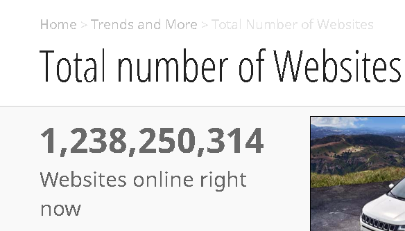
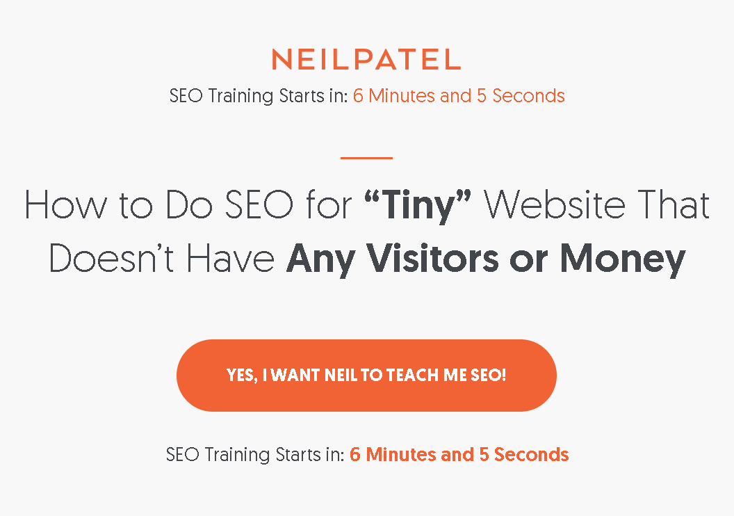

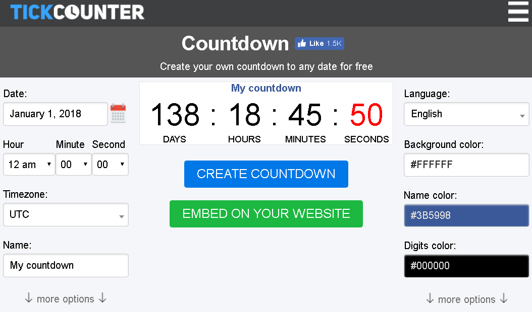
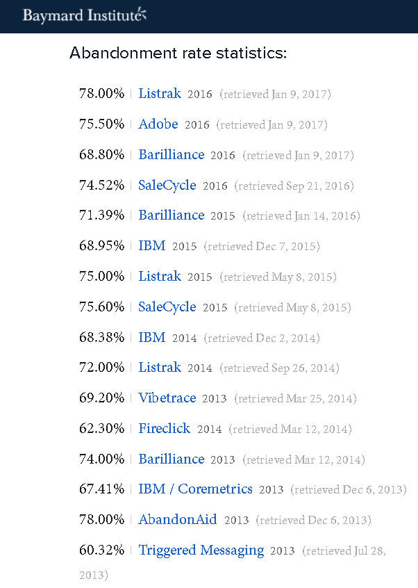

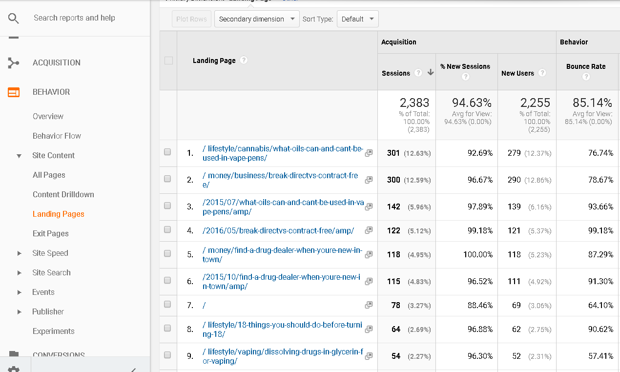
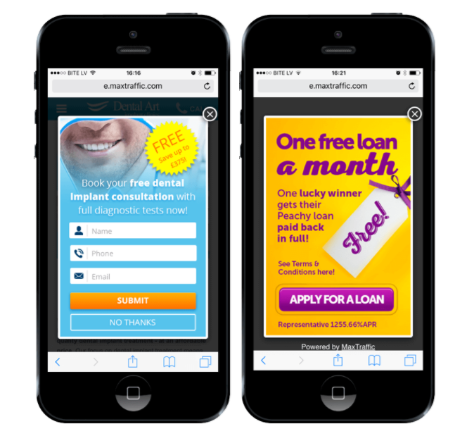
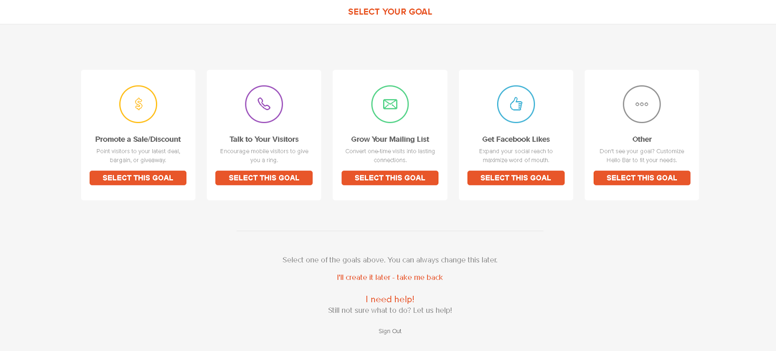
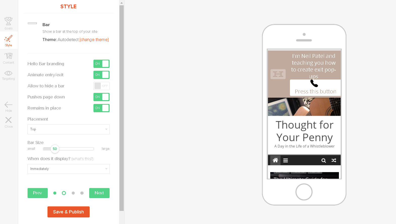
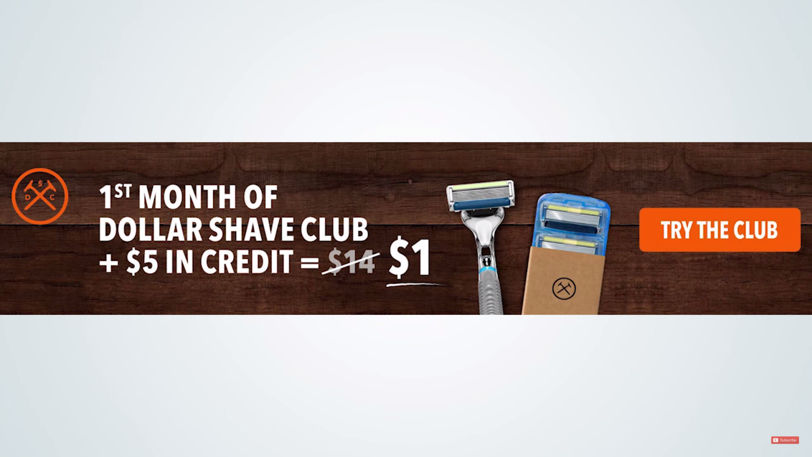
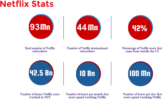

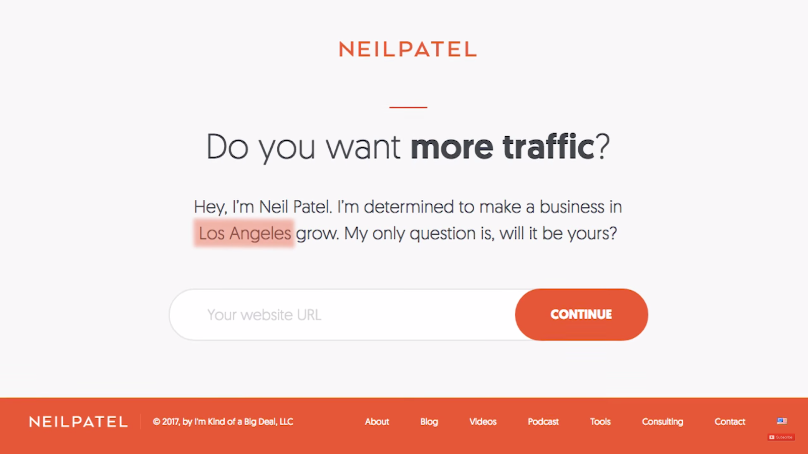

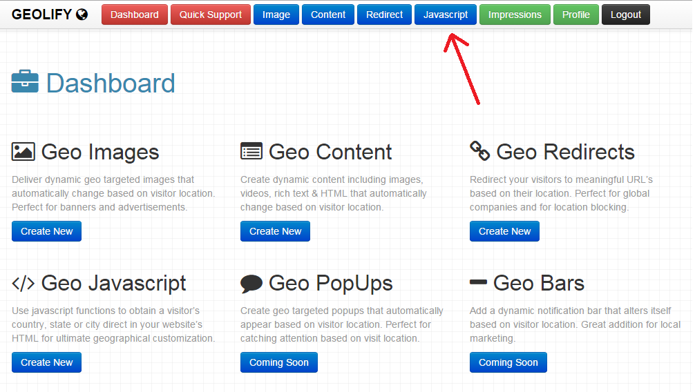
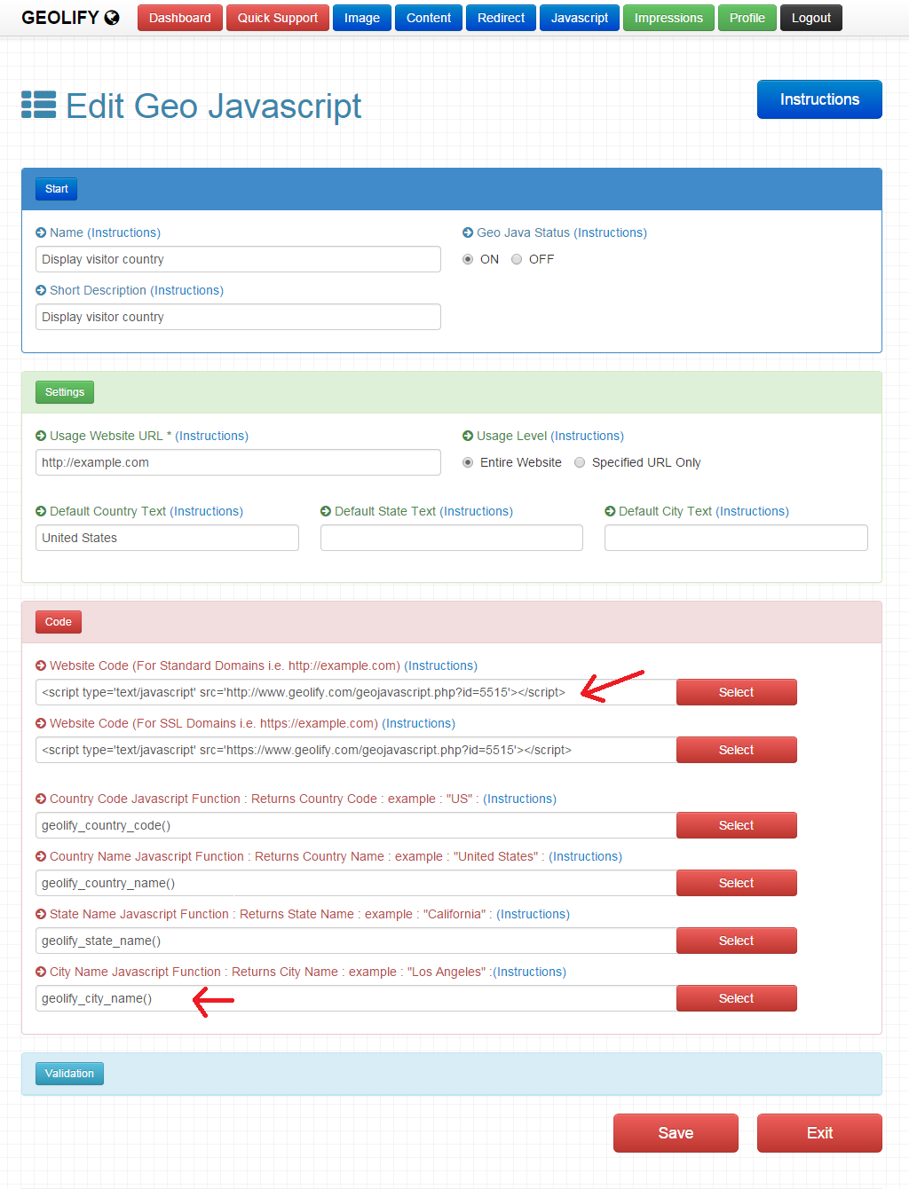
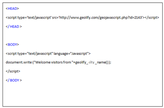
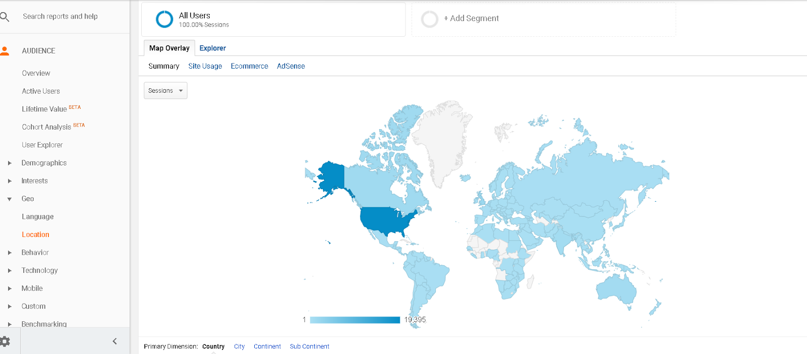
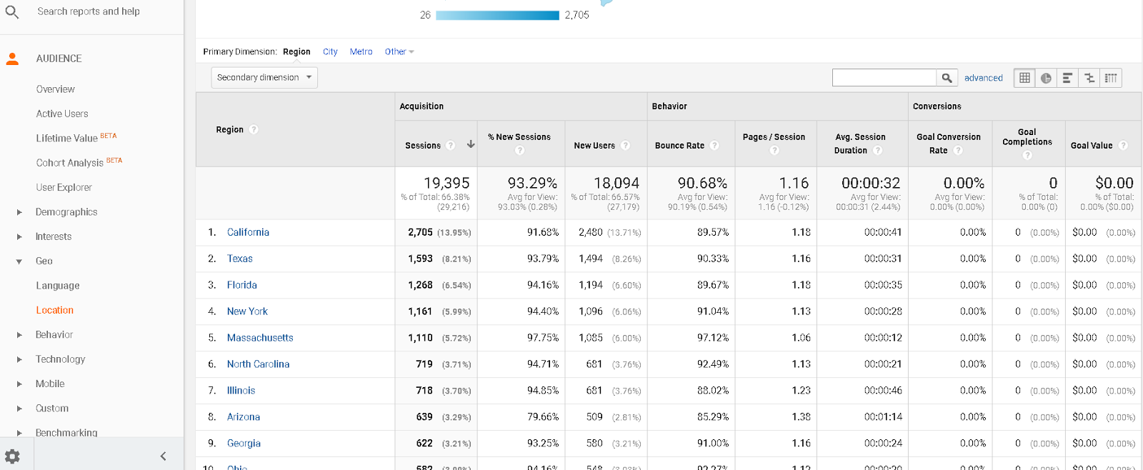


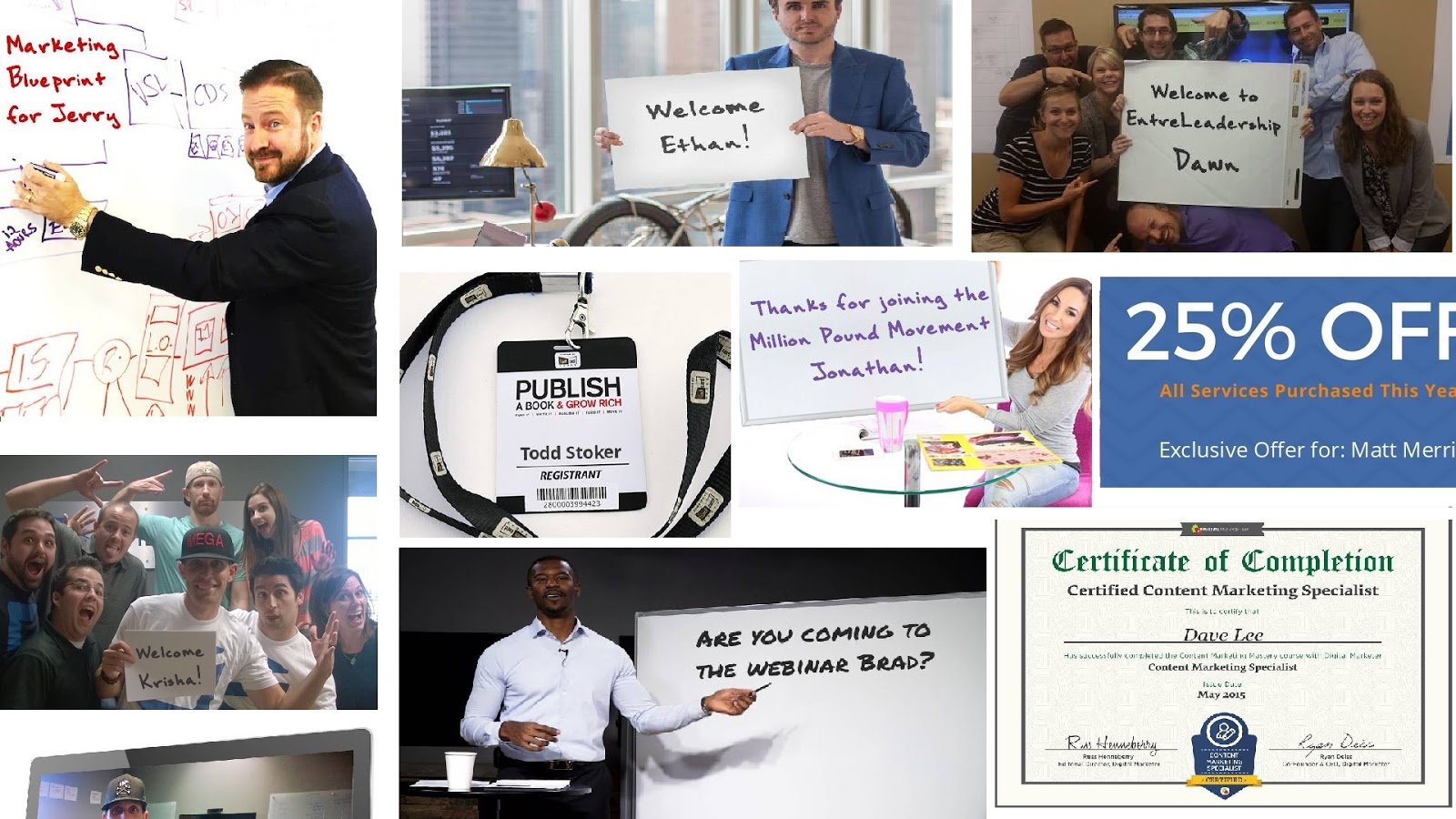
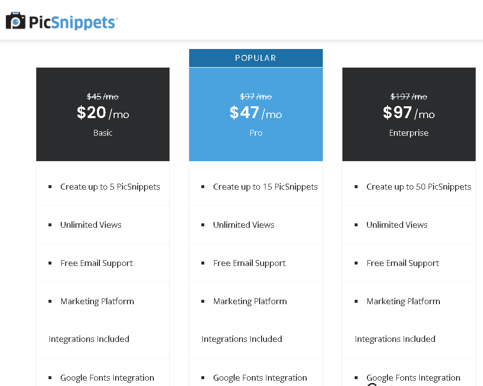
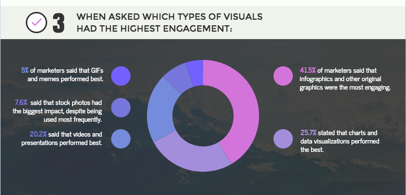
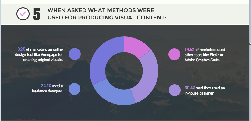
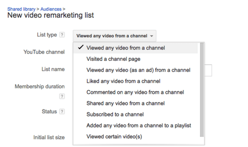
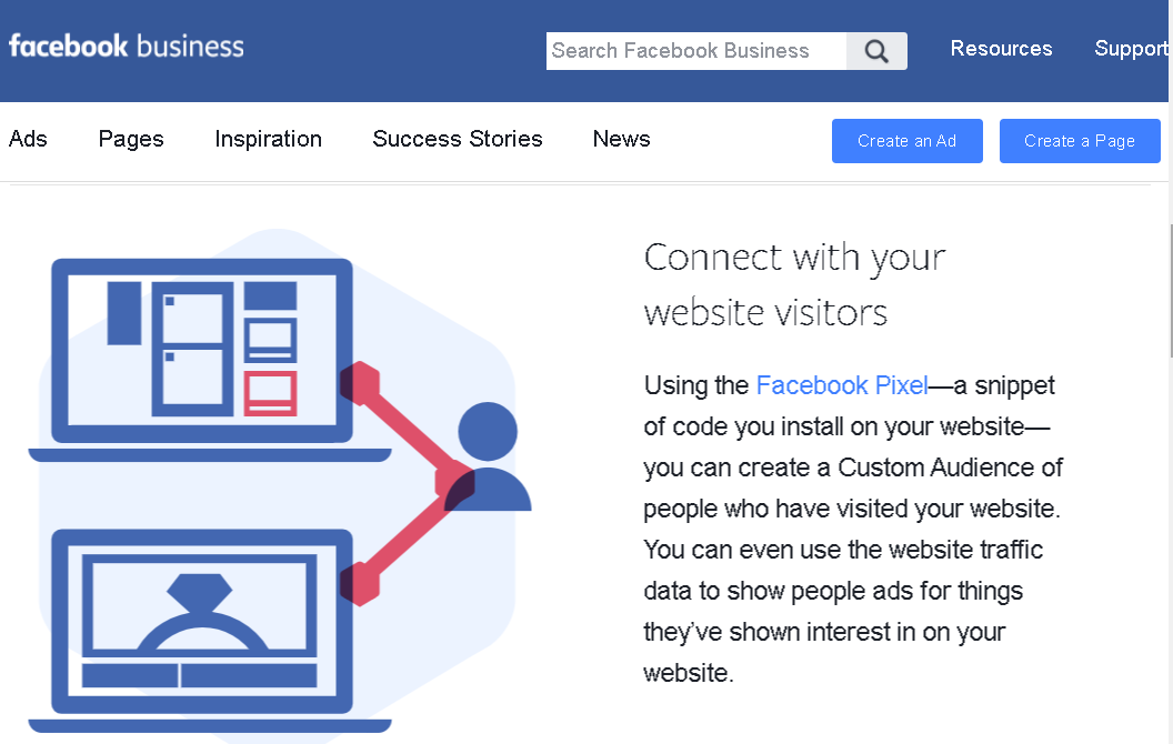
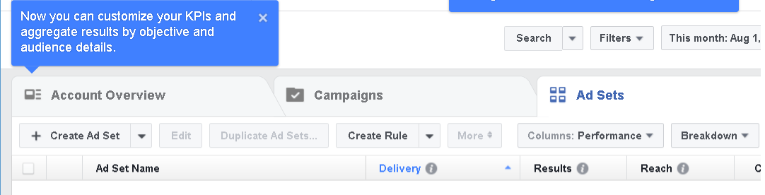
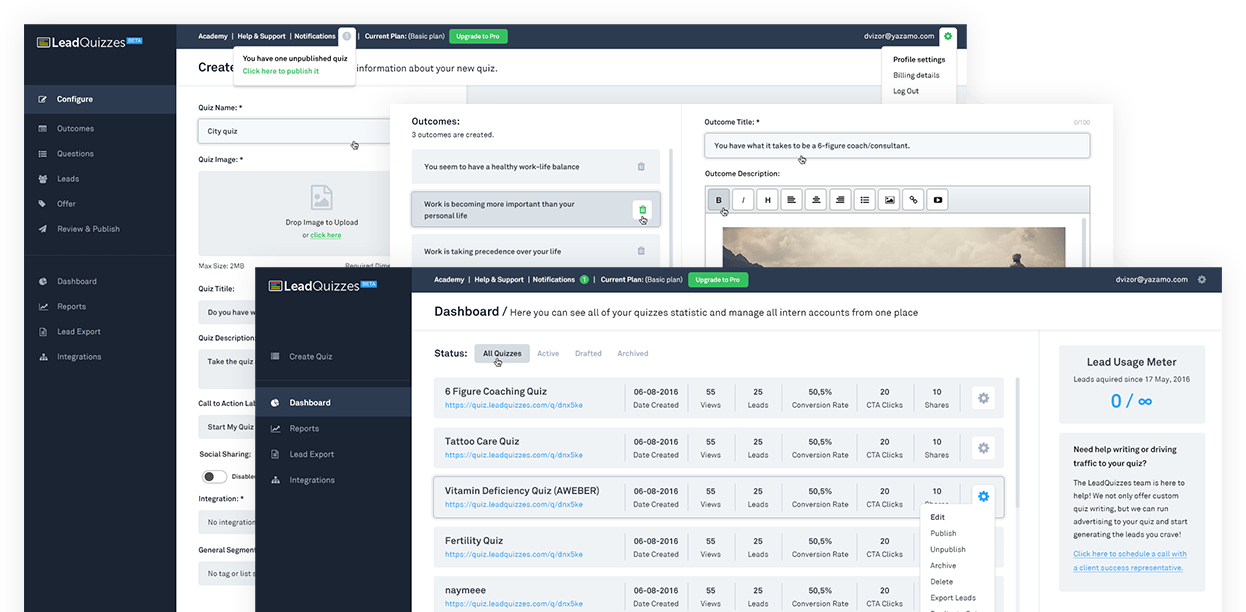
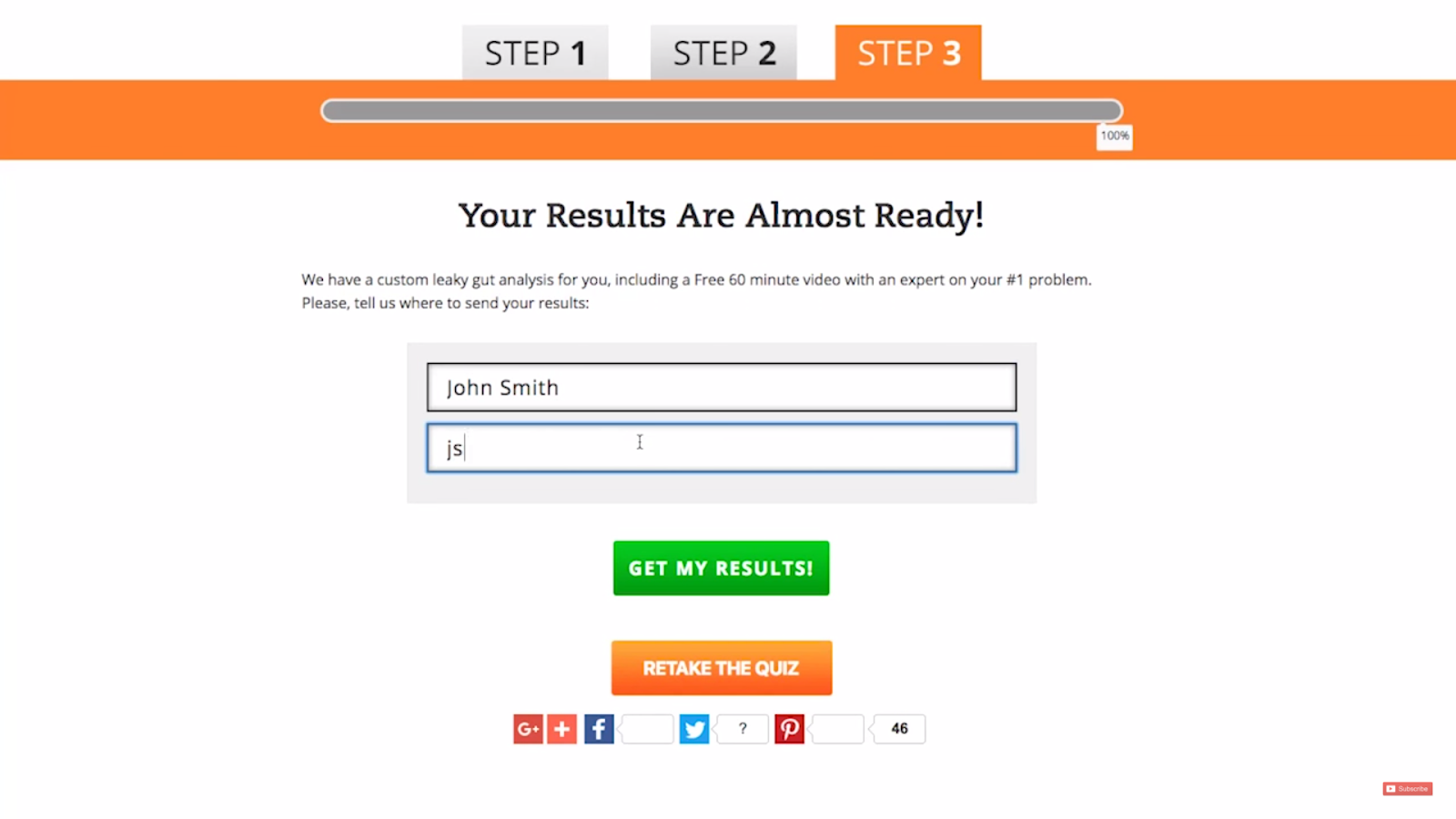
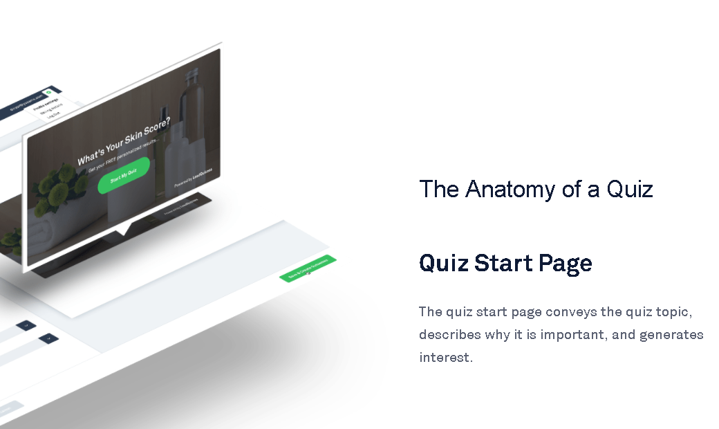
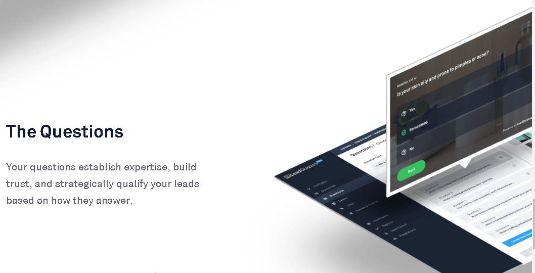
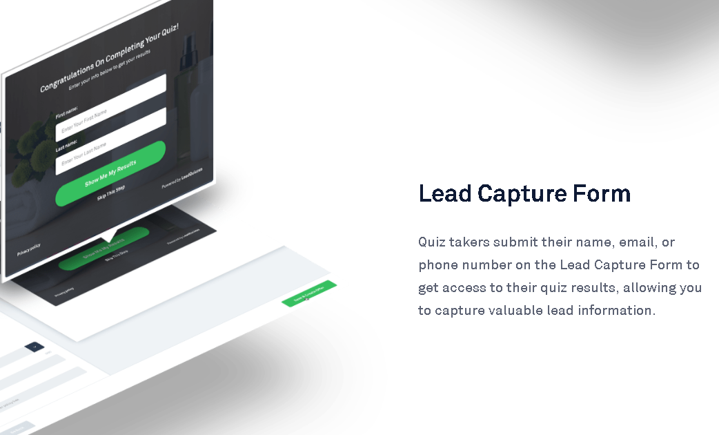
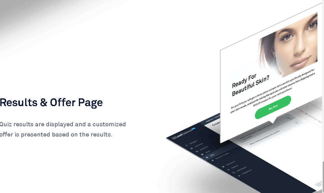
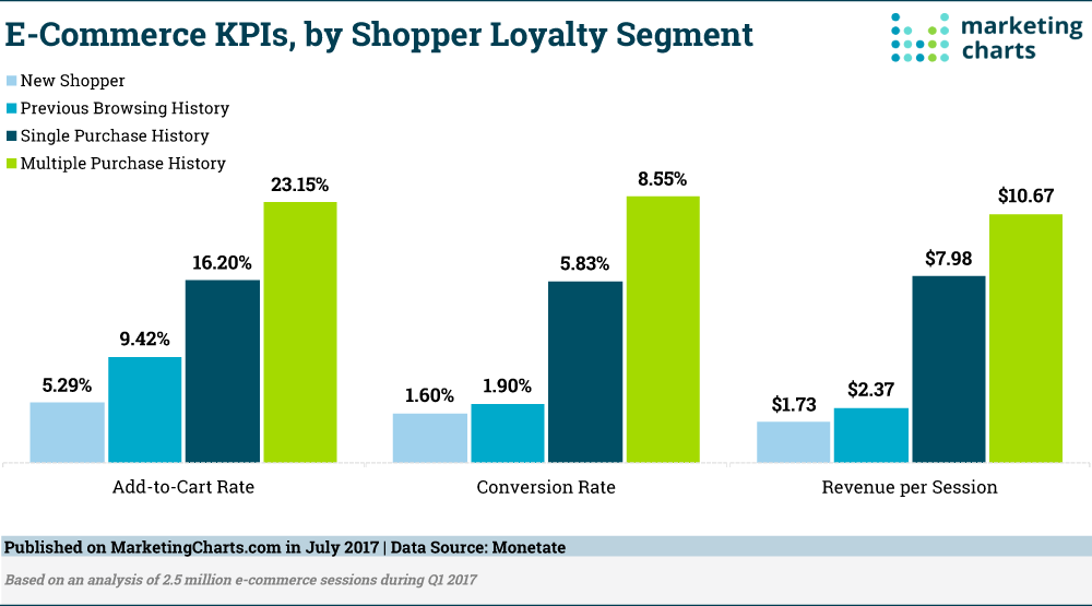
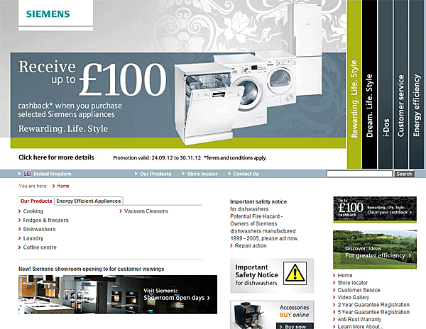
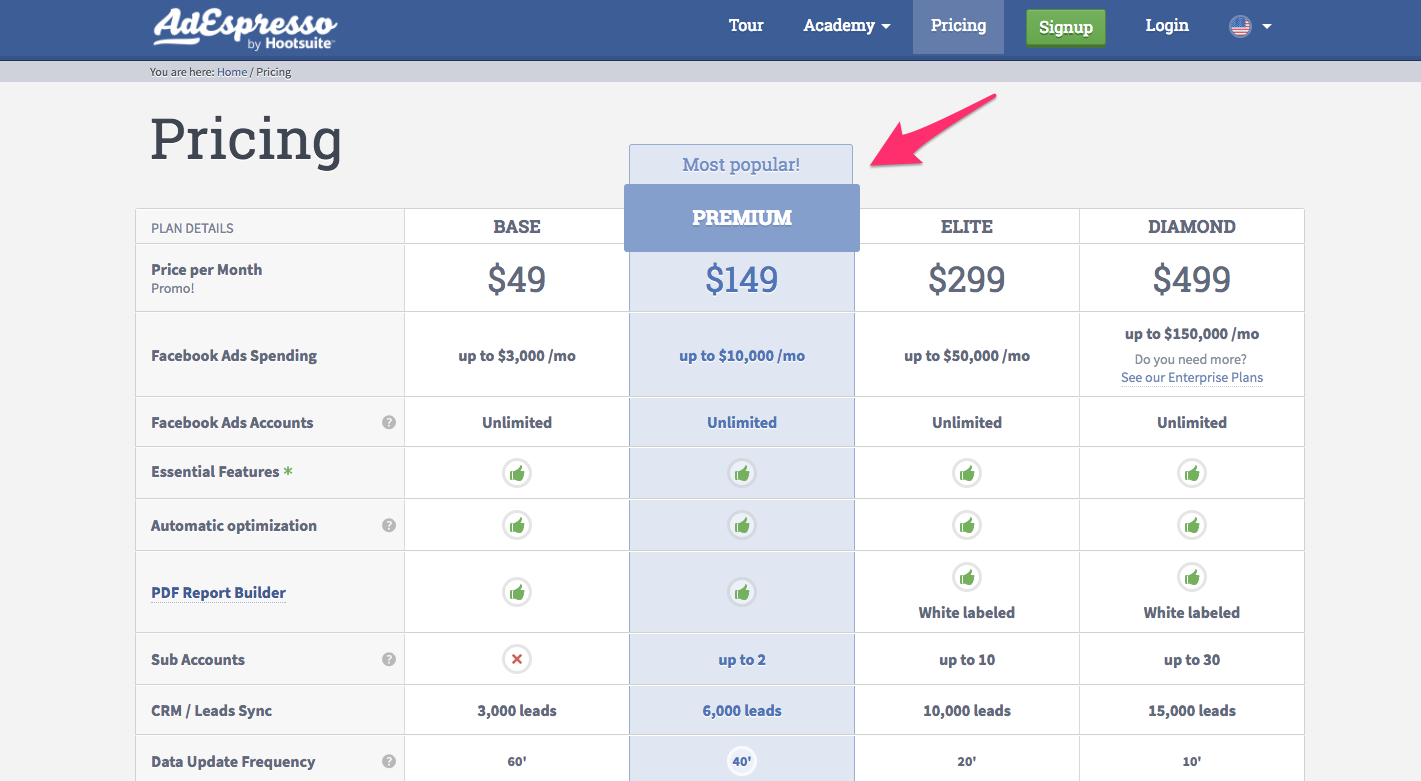
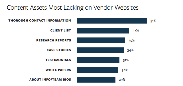
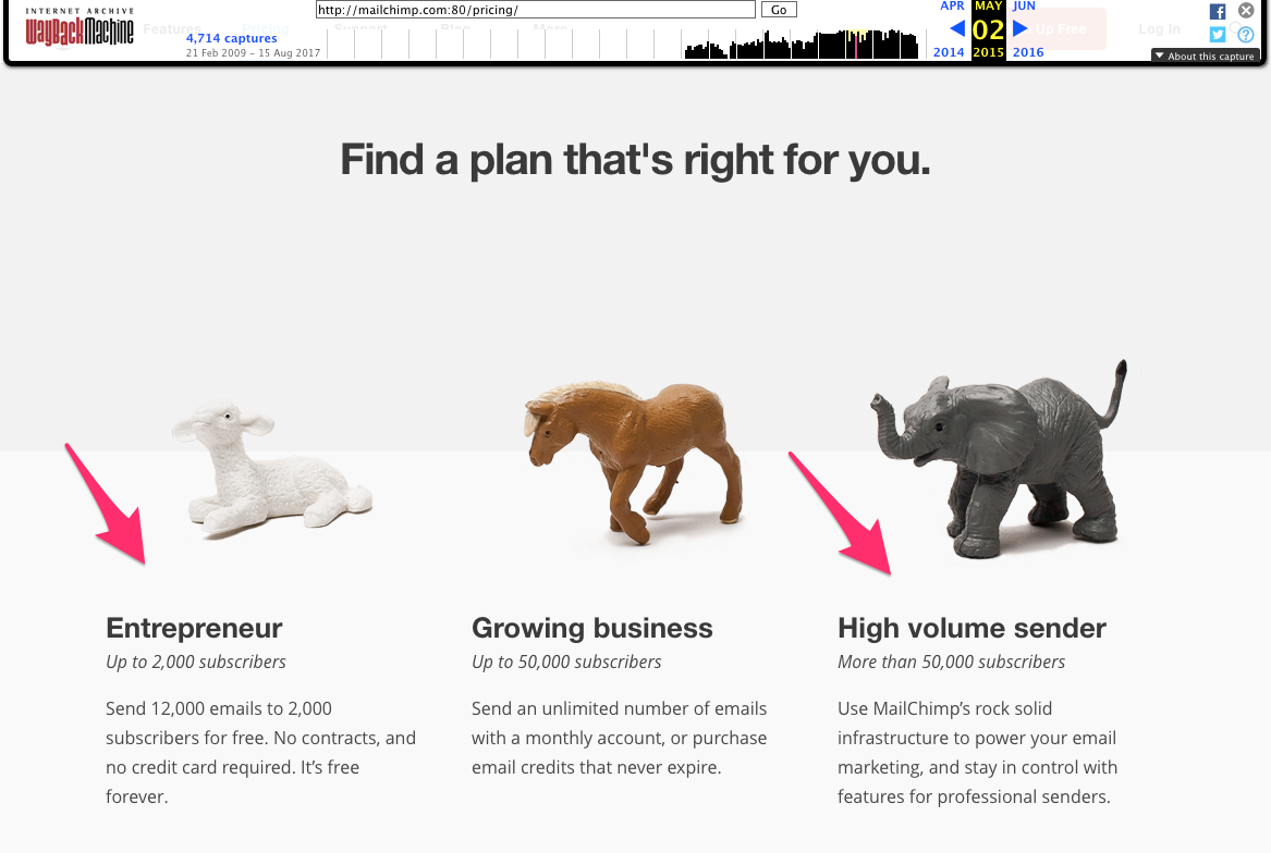
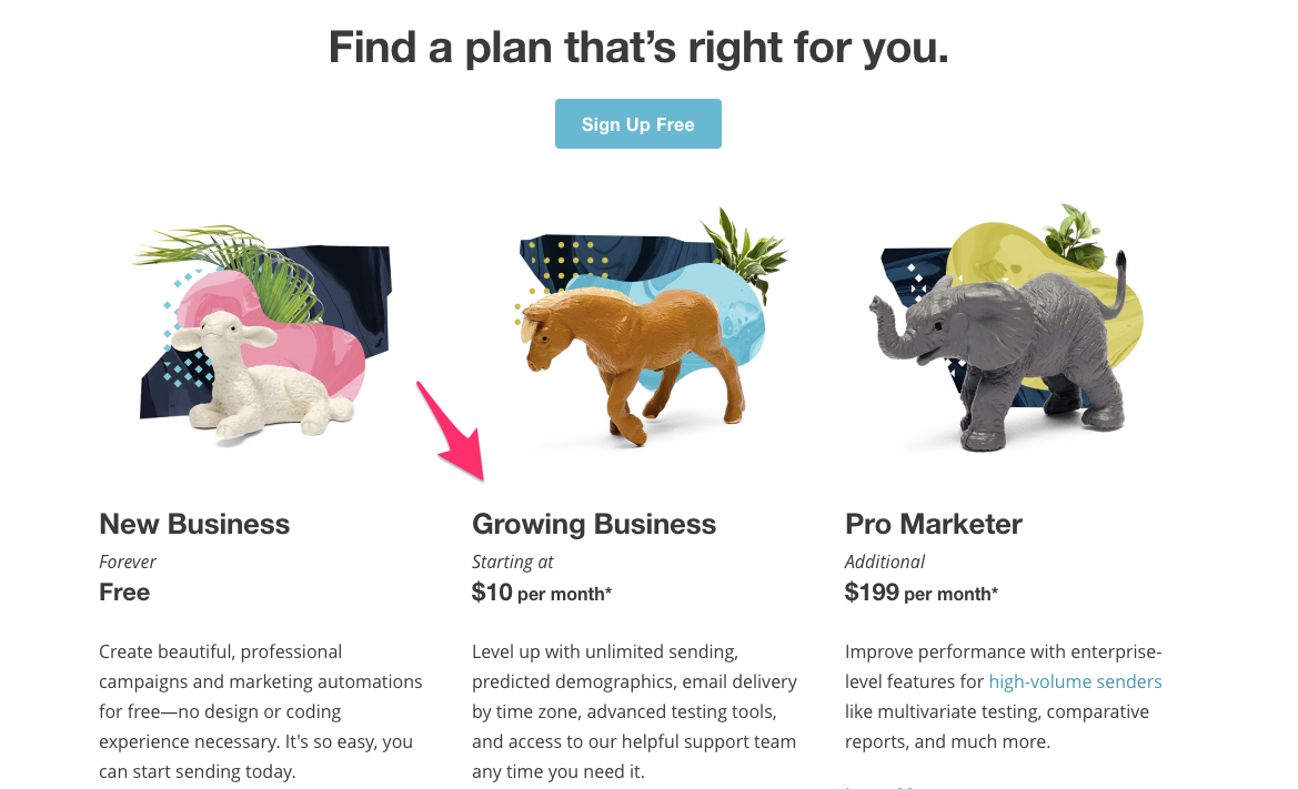
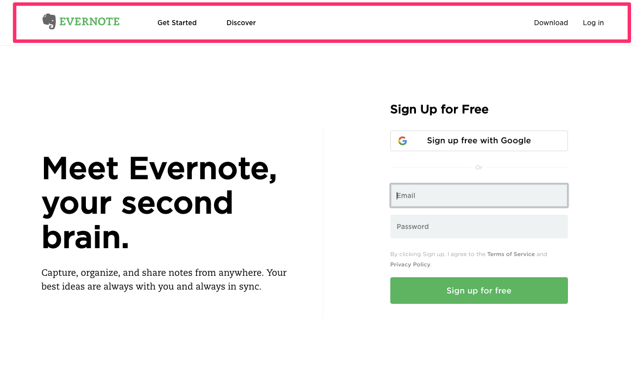

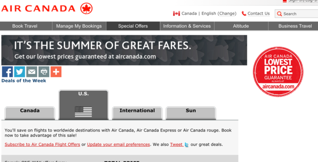
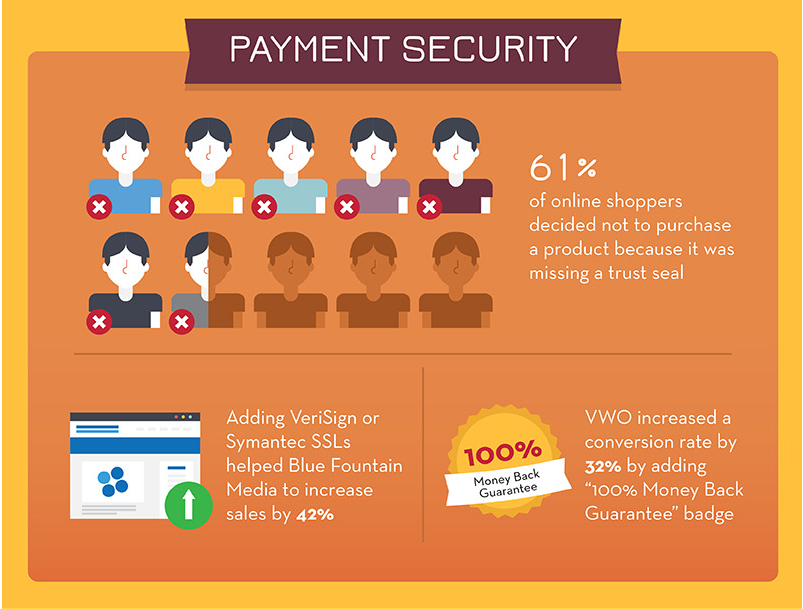
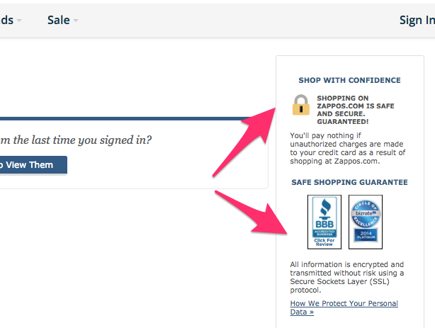
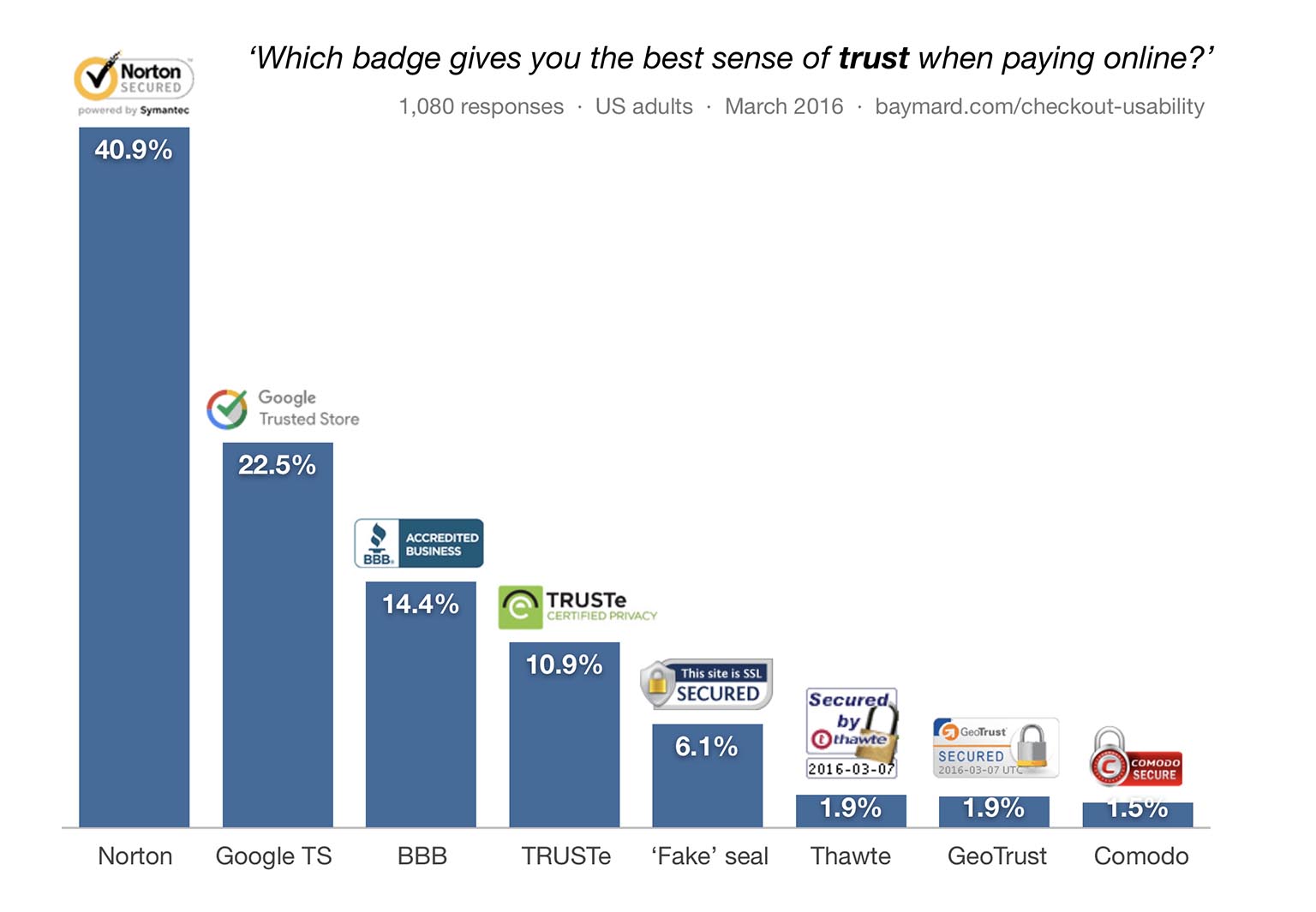
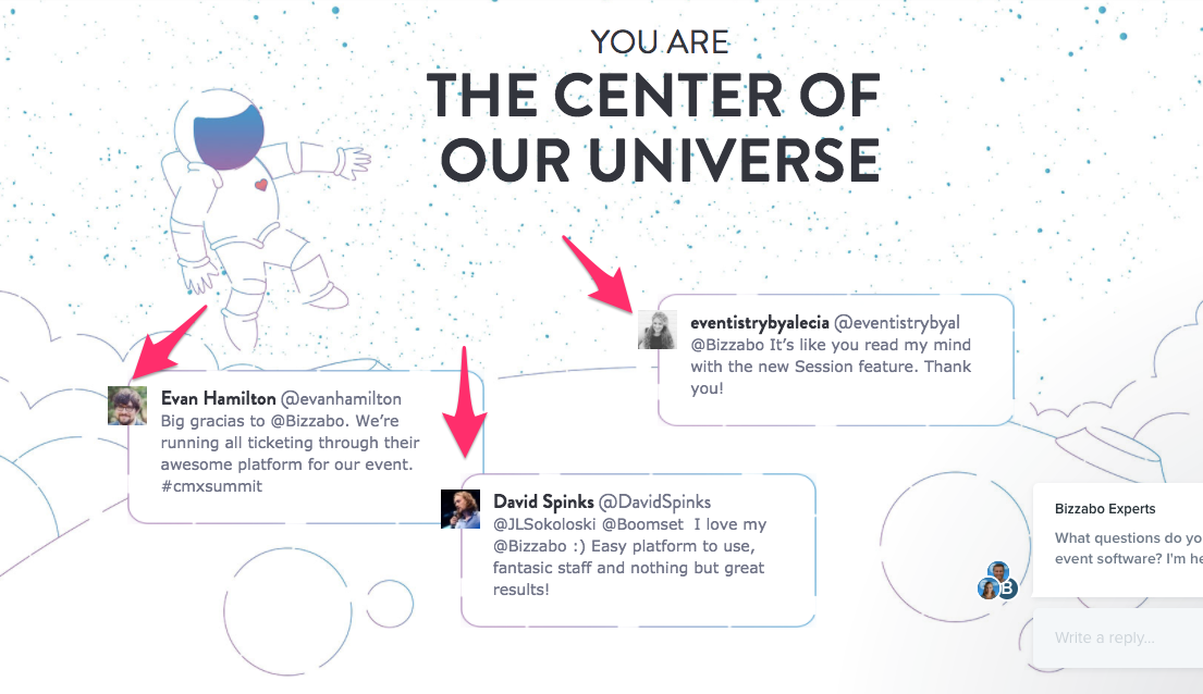
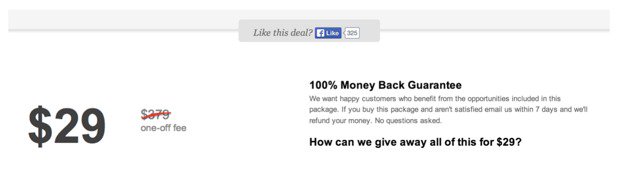
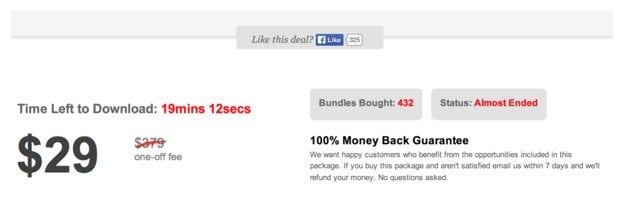
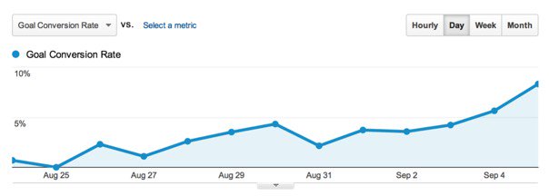
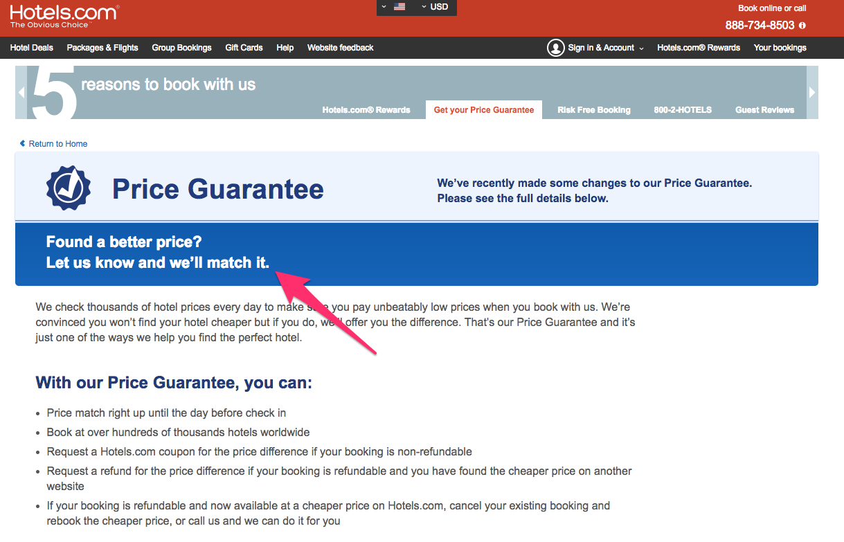
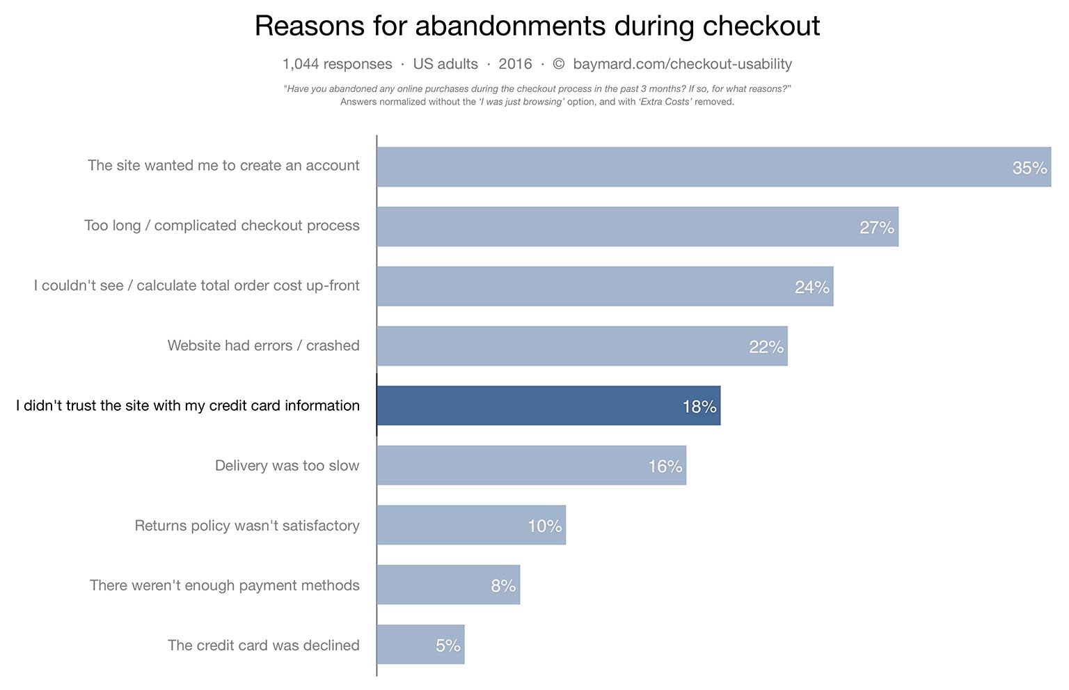
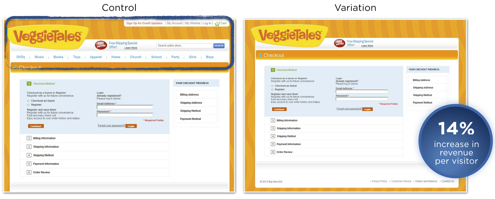
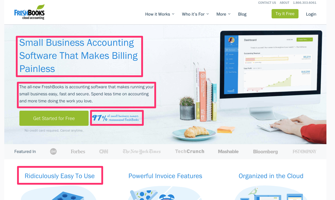
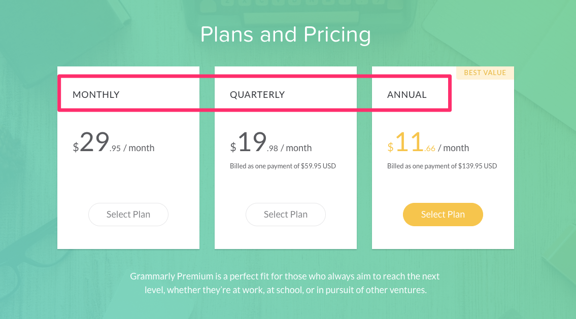


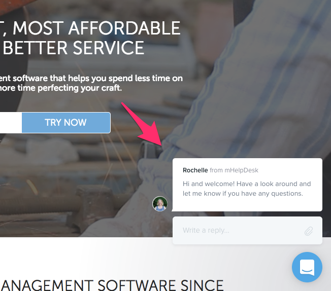
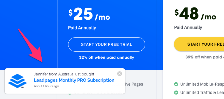
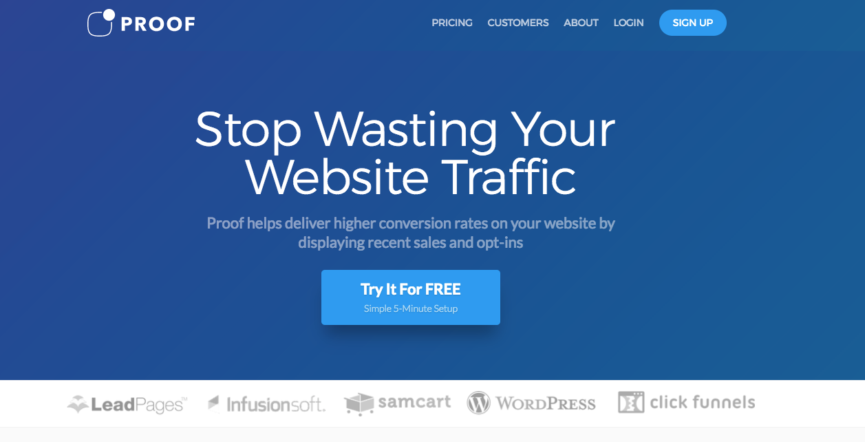
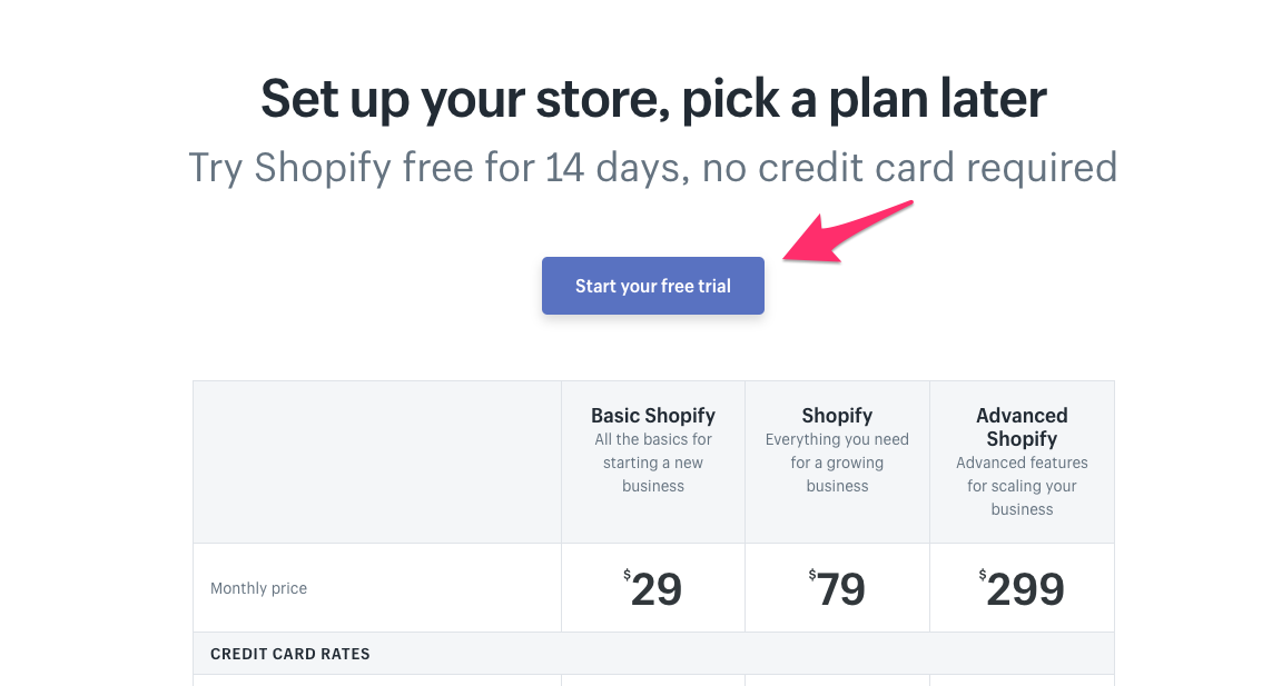

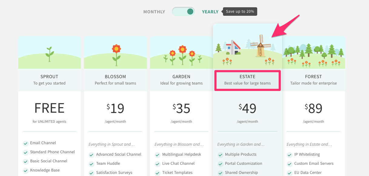

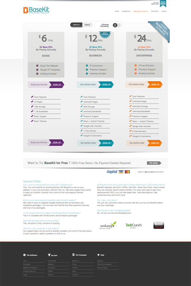
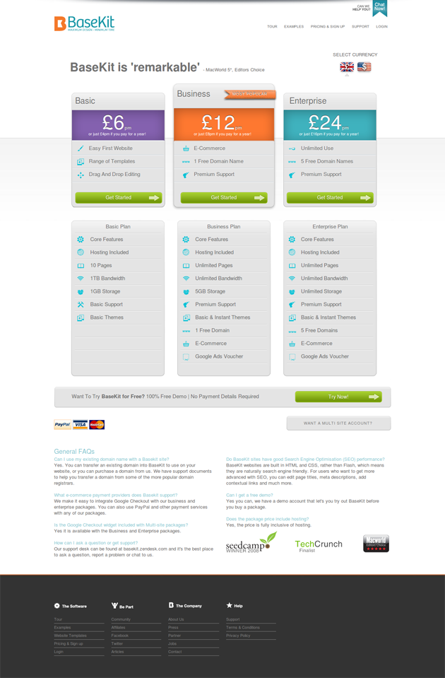
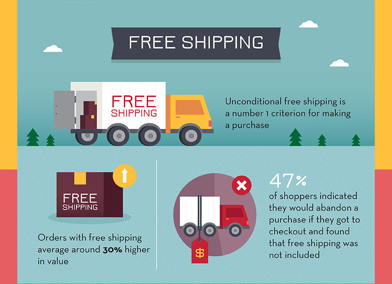
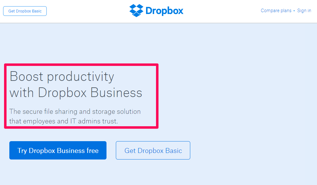
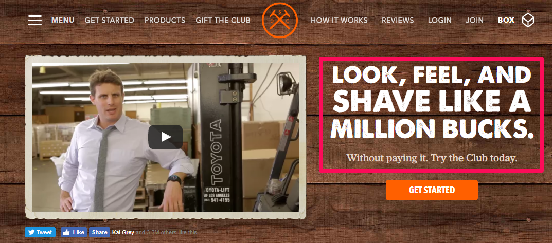
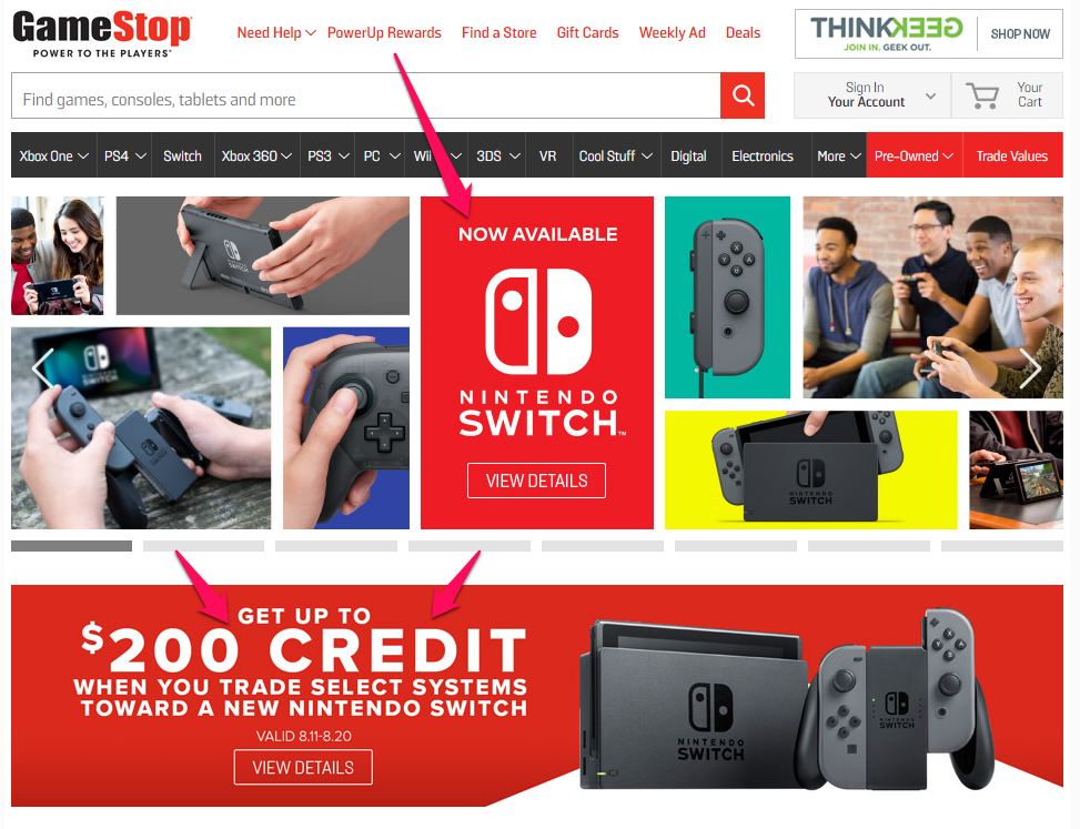
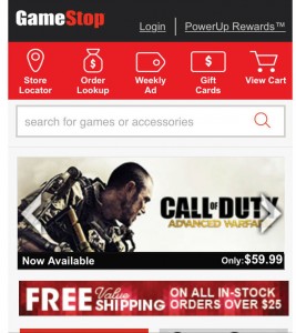
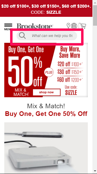
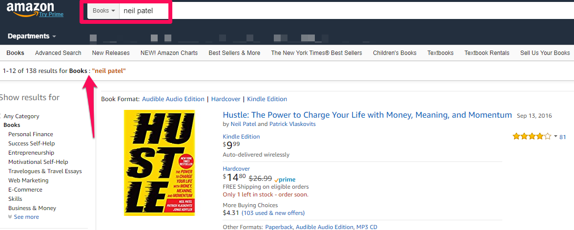
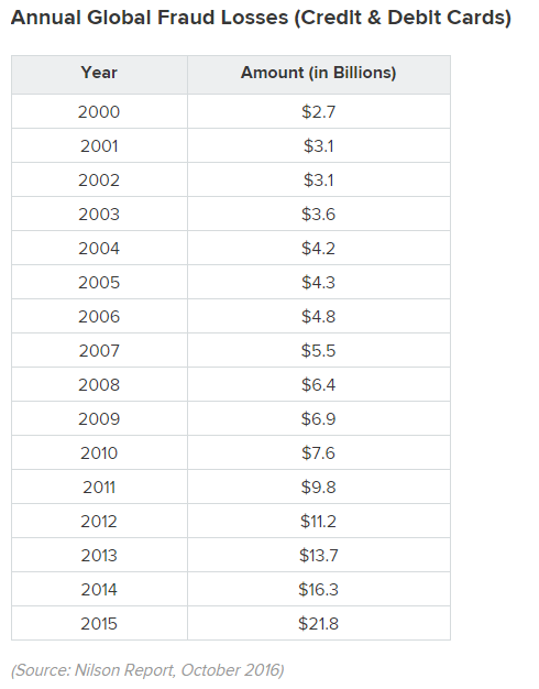
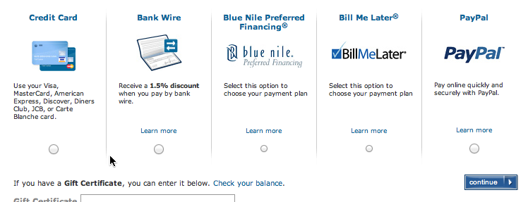
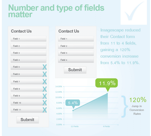
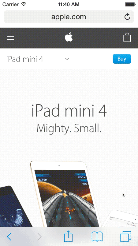
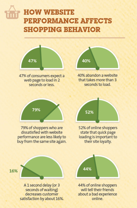
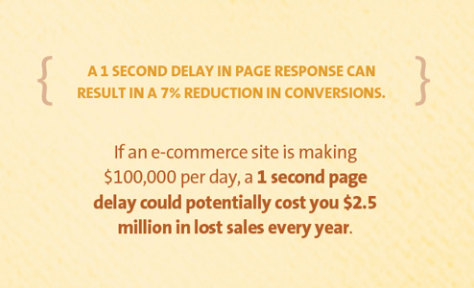
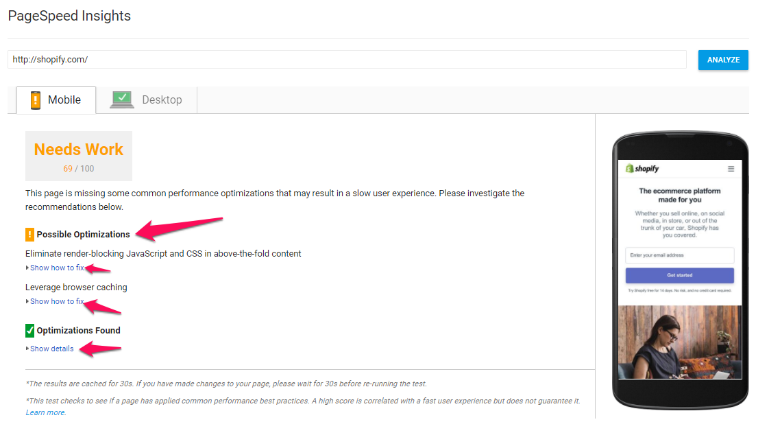
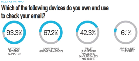
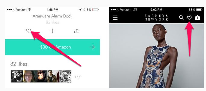
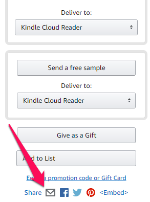


 RSS Feed
